Let There Be Lines pg 10: Production Graphics with Wendy Peck at webreference.com
 |
Let There Be Lines 10: Gallery | |
|
|
Don't forget to let us know what you've done. Send URLs, files, etc. to [email protected]. |
|
|
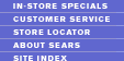
Creative shading creates lines to decorate and emphasize areas of the pages. Site designed by Iconixx group, Bethesda MD. Images © Cysive. |
|
GalleryThere are two problems when you come to the topic of lines in design: Where do you start? Where do you end? That is without even wandering to the question, What is a line?" There are so many variations of linear expression that it is impossible to do a thorough job of collecting samples. However, I have gathered a few samples to get you thinking about the techniques included here. Hopefully, you will be on the lookout during your online work for more ideas to add to your line arsenal Cysive Especially worth noting are the lines created by using slight variations in textures and transparency. The steps in the textured fill were probably accomplished with layer masks, which I will cover in a future tutorial, but the idea can also be applied to fountain filled lines. Note how the menu is included in the top striping. It slides right into the design of the page, but is still instantly evident.
|
|
A little shadow color at the end of a line grouping gives the impression that that section is rising from the pagegreat visual interest.
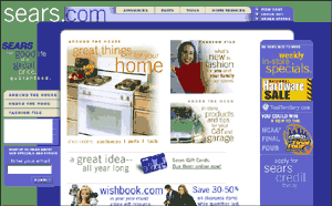
Hairlines separate menu items and tie the menu into the rest of the page. Images © Sears.com.
|
Sears I especially like the way the designer has used a little extra fill on the lines to create a 3D look for the menu areas and to highlight the com in the site name. This does nothing to sacrifice the message, but adds a lot of life to the page. The menus are very simple, but the lines added here separate the individual items and tie the menus into the overall look. In fact, there are many tiny lines quietly doing serious work on this site.
|
|
|
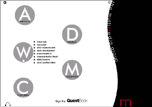
Mouseover menus are easy to find and add a linear touch to a flowing page. Site designed by Richard Apperly, Melbourne, Austraila. Images © Multimedia Group. |
Multimedia Group The menu items feature bullets that are large enough to form the impression of a line. A nice bit of linear contrast on a page that is quite round. Each of the dots contain menu items that pop out on a mouseover. The style stays very clean with only one menu list visible at a time, yet they are clearly labeled. Personally I would rather give up the clean look than have to play the find the menu game that many Flash (and other) designers like to play. This site has managed to deliver both a clean look and an easy to navigate interface.
|
|
| So ... a line is just a line could not be further from the truth. Lines are great design elements, since they can be beautiful, yet make a great contribution to the navigation and reader flow on your site. Let your imagination go ... what lines are just waiting for you to discover? | ||
|
|
Text as DesignLet There Be Lines Start
|


 Wendy
Peck is a working Web designer and writer living in NW Ontario, Canada.
Wendy
Peck is a working Web designer and writer living in NW Ontario, Canada.
URL: https://www.webreference.com/graphics/
Created: Mar. 16, 2000
Revised: Mar. 16, 2000
 Find a programming school near you