Text as Design pg 7: Production Graphics with Wendy Peck at webreference.com
 |
Text as Design 7: Mix It Up with Flash | |
|
|
You probably see more Flash samples than you realize. Many of the newest banner ads have been created with Flash, and it is no wonder. Flash provides a versatile set of tools for working with and animating text, the essential ingredient for every banner. The sample shown here is much like a banner. Simple words build a sentence, a phrase at a time. This is pretty basic Flash, but it takes a few steps to layer and overlap text. The methods that follow become even more important if you are looking to add tweening to your sample. It is not hard, but you need to do some planning in the beginning. (The movie is set to loop. If you would prefer to stop the animation, right click on the movie and click on Play to deselect that option. You can start it again in the same way.) Usually, we know what we want to say. If we are not turning our text into graphic elements, close enough is good enough, but not when you are creating a varied text phrase for Flash. We work with many layers and must convert from text to curves for most actions. You should also have a good idea which pieces of your statement will be the same style. We will put each of these on a separate layer, so plan it out at the start. This simple sample has 7 layers: background; W; hen; it has to be; right; it has to be; TEXT. If I had been overlapping text within words, the layers would have added up quickly. You can always go back and move text onto the same layermuch easier than trying to extricate text that is integrated close to, or overlapping other objects. |
|
|
Quick tip: When working with Flash, you will find your work proceeds much more quickly if you get into the habit of doing your initial construction off the movie screen. You should work on the correct layer, but move the objects into position after your basic construction is complete.
Quick Tip: When working with text, you are often working towards a frame where all the text will be shown. In this case, you may find it faster to work backwards. Assemble the text in the final frame, and remove unwanted objects for earlier frames. |
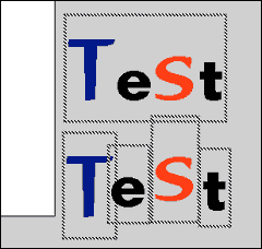
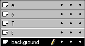
Create a new layer. (I like to create a layer called working, where I do my experimenting and initial construction before moving the graphics to the appropriate layer. I then delete the layer when I finish with the construction stage.) Choose the Text tool and type your first set of words. Highlight text and choose the main font, color and size. You can adjust font, size and color of individual characters. With the Text tool still selected, highlight the characters you would like to change and set the new attributes. Only the selected characters will change. In the example shown here, I have changed the font, size and color of the "T" and the "S", and the "e" is highlighted ready for a change. I will start this way, even if I will be placing one or more of the characters onto another layer. It is faster to create a text area with several characters and then copy or cut and paste them into separate text areas. Create a new layer for each of the separate characters. It is wise to give the layers meaningful names rather than using the default names. You will create many layers, and will waste time identifying the correct layer for future actions if you do not name them well. Highlight one character and copy (CTRL C) or, if you are brave, cut (CTRL X). Activate the appropriate layer. With the Text tool still selected, click in an unused area to create an empty text frame. Paste. The character will appear in the text area, which will be perfectly sized. In the example here I have marquee selected all the objects to show that each character is now a separate object. Now you can move them into position. Note that I am working off the main screenI like to do initial construction of elements off the page. I have included a sample of the layers used to create the image shown here. Note the how the order in the Layers menu is reflected in the order of the characters.
Carry on to the next page to add an outline or a graduated fill to your text. |
|
|
|
Text as Design Tutorial IndexText as Design Start
|


URL: https://www.webreference.com/graphics/
Created: Feb. 17, 2000
Revised: Feb. 17, 2000
 Find a programming school near you