Type Right for a Pro Look: Production Graphics with Wendy Peck at webreference.com
 |
Type Right for a Pro Look |
|
|
|
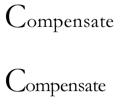
For those of us who came to Web design from a print background, a great shock awaited. We worked so hard in our print work to perfect typographythe standard by which print design is measured. As we started into Web design, we discovered that we had almost no control over text, not even the text size or length of the lines. Years of dedicated learning down the tube ... or is it? In my tours of great Web sites, I started to notice that the sites which caught my attention as well balanced and attractive designs, had perfect typography. Not in the body text, obviously (sorry if you thought I had the magic bullet) but in the headlines and menu items. We do have control over our graphic text. The other thing I noticed was that many sites missed being great sites because the designer had just "typed," not used "typography." There is a huge difference when text is carefully crafted. Take a look at the samples at the left. In the first sample, I have loosened the character spacing just a little, and tightened the normal spacing for the second sample. (Character spacing is called kerning and tracking in many design programs, and the commercial print world.) Notice how the second example seems to hold together better as a word. Sometimes, for style reasons, you want more space in your words. That should be deliberate and to reach a certain goal. Most times, you want your characters to be close together without crowding. |
|
|
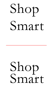
Default line spacing, as in the top sample is too large. When the spacing is tightened, it is easier to read the headline as a unit. |
One of my pet peeves in text work of any kind is line spacing that is far too large. Look at the first "Shop Smart" sample. The default line spacing, which is called leading (rhymes with sledding) in some programs, is usually far too large when using large type sizes. Too much space makes it difficult for the eye to see the headline as a unit. In the second sample, I have tightened the spacing. Cover one and then the other on the screen with your hand and pay attention to how you read each sample. You will find that when the line spacing is large, you tend to read each word individually, rather than seeing the phrase as a unit. When we are talking only about character or line spacing, the best guide is your eye. Many of you, especially if you are used to working with your software, will already be better text designers, simply because you are now alert to watch for gaps. Unfortunately, the effect of poor typography is very subtle. You may have to read the headline twice if the line spacing is too large, or the character spacing too tight, but you are unlikely to blame the type. As a designer, though, if you start to focus on your typography for your display text, you will soon discover that your page design improves. |
|
|
|
|
|
|
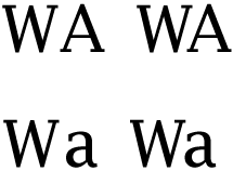
The first and second set of characters in both the top and bottom sample have the same settings. The upper case example with close character spacing is too tight, and the different angles of the characters are not attractive. It is also cramped, making it hard for the eye to separate the two letters (although this character pairing often requires tighter spacing). The first sample is a little too loose, and would be better with a slight tightening. In the lower sample, the tighter version works much better. |
What do you watch for? There are a few common things to watch for. The first is the line spacing as I described above. Watch also for gaps in words caused by various letter combinations (see left). With the proliferation of freeware and shareware fonts, the way that characters pair together is not always attractive. You do not have to forgo the font you want, just be watching for ways to improve the appearance. In print work, we tend to work only with professionally designed fonts, since we have the freedom to do large passages of text with fonts. Changing the spacing for several combinations of characters in 60 pages of text is not practical. In Web design, our font use is only display text, so it is reasonable to adjust the letter pairs or entire passages when necessary. Note: When I refer to type being used as a graphic, I am always referring to the specialty text you have on your pageheadlines, menus, pull quotes, perhaps captions. There is no excuse for taking body text and creating a graphic just to have the text control. The increased download time has no justification, and a good designer will use the most appropriate tools for a given task. Carry on to learn more about the basics before we move to the software section which will show you how to accomplish all major typography effects. |
|
|
|
Type Right for a Pro Look Tutorial IndexType Right for a Pro Look Start |

URL: https://www.webreference.com/graphics/
Created: May 8, 2000
Revised: May 8, 2000
 Find a programming school near you