Type Right for a Pro Look pg 3: Production Graphics with Wendy Peck at webreference.com
 |
Type Right for a Pro Look: PhotoShop Typography Methods | |
|
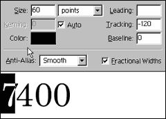
Tracking set to 200, a positive number, opens the characters. A negative number moves characters closer together.
Selection one character and adjusting the tracking affects the spacing between the selected character and the one immediately ot the right.
Kerning between the characters gives the same effect as adjusting tracking for individual characters. |
PhotoShop has excellent type control for a graphics program, probably due to its popularity for print as well as Web design. The methods that follow assume you wish to create text as a message rather than as a wild and artsy graphic. If you are also interested in art text, make sure you take a look at Text as Design. Tracking and kerning When we want to adjust the spacing between characters without affecting the entire text entry, we can still use the tracking command. Highlight the character ahead of where you would like to change the spacing. Specify a positive number to create more space between the selected character and the one immediately to the right, and a negative number to reduce the space. Technically adjusting spacing between characters belongs to the kerning feature, but I find tracking selected characters is easy and faster in many cases. Kerning is officially designed to adjust spacing between characters. The default is set to auto, which will give you the settings the font designer included with the font. Rarely is the default OK at display sizes unless you have purchased a specific display font. To adjust kerning, in the Type Tool window, insert your cursor in the spacing you wish to adjust. Click on the Auto box to uncheck. Enter a positive value to increase spacing or a negative value to decrease spacing. I have used a large positive number here (200) to show a visible gap, though in most cases, we will be reducing the kerning. You can use both tracking and kerning to speed your work. At first, adjusting spacing between characters will seem like it is too time consuming. With a little practice, you will find it is very fast. Try setting your tracking to a value that gives the appropriate spacing for most of the characters. Then move to the individual character tracking as described above, or kerning to adjust the final character spacing. Tracking will often take care of most awkward spacing. Experiment with the kerning and tracking features until they become like second nature. If you wish to create work with a professionally designed look, learning to kern your display type will take you further than even the most amazing special effects. Correct typography can really separate the pro designer from the not-quite-there crowd. |
|
|
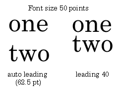
The auto setting for leading is too large for all display text.
Highlight the text and specify leading value. That's all there is to adjusting line spacing, plus your changes are reflected in your text entry screen so you can easily find the best setting. |
Line spacing (leading) Warning: I am talking only about display text with the spacing. Body text, the bulk of your message, requires at least the default line space setting to be easily read. Where legibility can be a problem, like with an older group of people who do not see well, the secret is not to use a giant type size. In fact, 14 or 16 pt type is very hard to read as body copy. Instead, increase the line spacing for an 11 or 12 pt type size. For best legibility, space is a very good thing in body text, and a very bad thing in display text. This is one double standard you should adopt! So the bottom line is, you are always going to have to reduce line spacing on display text. However, nothing could be easier in PhotoShop. Type in your text, using hard returns where you desire your line breaks. Select the text and specify the leading you desire. The changes will be reflected in your working screen, so you can find the best fit visually. If you have other areas of text on the page, or even on the site, you should make note of all your settings so you can create a uniform look for each display text area. Now you know how to adjust character spacing and line spacing. Those are the most important basics, and we can move onto manipulating text for great effects. |
|
|
|
Type Right for a Pro Look Tutorial IndexType Right for a Pro Look Start
|


URL: https://www.webreference.com/graphics/
Created: May 8, 2000
Revised: May 8, 2000
 Find a programming school near you