Type Right for a Pro Look pg 4: Production Graphics with Wendy Peck at webreference.com
 |
Type Right for a Pro Look: Customizing Text | |
|
A good sample to practice several typography tasks.
Small characters are too fine to fit with large characters.
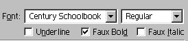
Faux Bold is used to thicken the small characters.
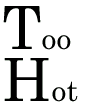
Baseline shift 15 and and kerning value of -200 produce the result here.
|
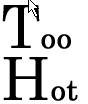
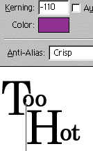
You have the power now to make great looking text. Let's move on to those special situations which come up all the time. You need the freedom to move selected characters up or down, and in PhotoShop, you will use Baseline for this task. In the sample at the left, several typography actions have been applied. To move the "oo" and the "ot" up, each was selected and a positive value was entered for Baseline. The next sample shows the text after font sizes were changed (highlight the character you wish to change and specify fonts size) and before baseline shift was applied. We still have some kerning to do, but that can wait until we move the text up. Also, notice how the large letters appear to be much thicker
than the small letters? This is not surprising, since the large character
is 80 points and the small is only 40 points. We can cheat a little
to solve that problem. Now we are ready to move the characters up. Highlight the "oo" and specify a baseline value of 15. In this sample shown at the left, I have also moved the "oo" in under the "T" with a kerning value of -200. For the final look shown above, you will repeat the baseline shift for the lower word, using a baseline value of 7. Kern the letters in both the top and the bottom words. Finally, you want the lower word to snug up into the spaces of the top word. This is accomplished by adding two spaces in front of the word "Hot" and reducing the leading. The leading in this case was set to 50. I then kerned the space between the first word and the beginning of the second word as shown here. And that's it. A little final kerning once you have the full view with color, and you have a fully editable, but interesting presentation of your message. Typography is one of the few elements of design where studying the subject can make it easy to measure difference. There are many rules, which makes it easier to absorb and put into practice. Once you know what to watch for, much of typography can be accomplished by what looks right. I find the "right for sure" feeling comes much more easily to me with type than it does with any other element of design. So ... even if you do not have the creative genius to become a world famous designer (like most of us in this field), you can learn the rules and become a superb typographer. Great type shows instantly. |
|
|
|
||
|
|
Typographers quotes Keystrokes for Typographer's quotes:PC (use the number pad and hold the ALT key down until you have
typed in all the numbers) Mac |
|
|
|
|
|
|
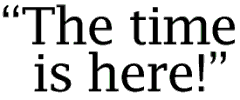
Use the spacebar to move the second line over to the approximate location and then kerning to fine tune the alignment.
In the main view, confirm the alignment by placing a guideline. Adjust if necessary. |
Aligning text with quotes Insert your cursor at the beginning of the second row. Add two spacebar spaces (or the number of spaces that brings the second row as close as possible to lining up with the text in the first row. Increase or decrease your kerning between the second space and the first character of the second line. The text in the top line should line up perfectly with the text in the second line. Adjust until you are satisfied with the result. I will usually check the positioning in the main window by placing a guideline. You now have the tools for excellent typography in PhotoShop. |
|
|
|
|
|
Type Right for a Pro Look Tutorial IndexType Right for a Pro Look Start
|


 Simply
highlight the smaller letters and check the Faux Bold box to activate.
The letters become just a little thicker and balance with the larger
font.
Simply
highlight the smaller letters and check the Faux Bold box to activate.
The letters become just a little thicker and balance with the larger
font. 
URL: https://www.webreference.com/graphics/
Created: May 8, 2000
Revised: May 8, 2000
 Find a programming school near you