Type Right for a Pro Look pg 7: Production Graphics with Wendy Peck at webreference.com
 |
Type Right for a Pro Look: Fireworks Baseline and Quotes | |
|
A view of both the Type Editor window and the resulting appearance of text manipulated into a graphic style. I do not recommend this as a way to do all your stylized text, since you would have more freedom if the components were separate. However, it is a very good example of how much power you have just using the text tools in Fireworks.
Green lines represent the original baseline, with the lower image baseline raised for a better fit with the initial cap. |
Character and line spacing are the most valuable techniques in a typographer's arsenal, but there are a few more tricks that will provide even more flexibility for you. Moving individual characters up or down is handled through the baseline, and is an essential part of creating stylized text. You must learn to do typographers quotes as well. It takes little to learn, and the difference is well worth the small time investment. Raising the baseline To raise the baseline, choose your Pointer tool and double click on
the text you wish to change. Position your Text Editor window so you
can see your text in the document. In the Text Editor window, highlight
the character(s) or word(s) you wish to have raised or lowered. The sample at the left shows a larger initial character, with the baseline of the remaining characters raised for a more artistic look and to take advantage of character shapes. The kerning was also adjusted to move the text into the hollow of the initial character. The green lines represent the original baseline. |
|
|
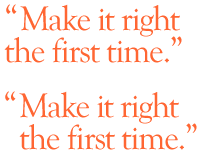
A few minutes of extra text adjustment will add a very professional touch to your work. Both samples use typographer's quotes, and the lower version has been kerned for a better appearance.
Adjusting the kerning to line up the first character of the first and second line. Note how the final document version is visible, and has been magnified for exact alignment.
|
Typographers quotes Keystrokes for Typographer's quotes:PC (use the number pad and hold the ALT key down until you have
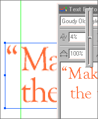
typed in all the numbers) Mac Your quote will look much better if you align the text in the first and subsequent rows, and allow the opening quote marks to appear in the margin. Notice how much better the lower sample at the left looks with this adjustment. Enter your text, making sure your line breaks are in the correct spot. Adjust the kerning and leading as required. Return to your document and place a guide at the first character in the first row. We will use this to precisely line up subsequent rows. You may also wish to zoom in before you return to editing your text. Double click on the Text to reopen the Text Editor window. Position this window so you can see the document view of the text you are adjusting. See the sample of this setup at the left. Place your cursor in front of the first character in the second line. Add one or two spaces to bring the first character roughly in line with the first character in the first line. Adjust your text to the right or left with the kerning control until the text lines up perfectly with the guide in the document view. This method sounds like more work than it really is, and once you are used to working with kerning, it can be done very quickly. There are many other applications as wellkeep your eyes open. You can find examples of excellent typography on the Web and in the magazine world. The more you see, the better you will be. |
|
|
|
|
|
|
|
Type Right for a Pro Look Tutorial IndexType Right for a Pro Look Start
|


URL: https://www.webreference.com/graphics/
Created: May 8, 2000
Revised: May 8, 2000
 Find a programming school near you