Type Right for a Pro Look pg 5: Production Graphics with Wendy Peck at webreference.com
 |
Type Right for a Pro Look: PaintShop Pro Typography | |
|
The top line is as typed. The second line has an overall kerning setting of -40, but notice how the "t" and "i" as well as the "i" and "n" are too close. The final line shows individual adjustment for the problem characters from the second line.
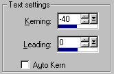
Kerning settings in the Type Edit window. Negative values reduce character spacing, while positive values increase spacing. |
Make sure you have read through the introductory pages of this tutorial before you try the methods. Knowing how to accomplish an action in typography is only a small part of creating excellent text work. Character spacing, or kerning, is the most commonly used typographic command, so we will start here. Most text that you work with at display size will require some adjustment. Start by creating vector text on a new vector layer. PaintShop Pro does not offer a real time view of the kerning changes you are making, so you will be moving back and forth between the canvas and the Text Entry window. This will seem awkward at first, but you will soon develop an instinct for the kerning settings each situation requires. In the sample at the left, the top line shows how the text appeared with no adjustments. If you look closely, most of the characters are a little too far apart, although the "t" and "i" and "i" and "n" are quite close. For faster kerning, I started by applying a kerning value to the entire word as shown in the second line.
Click OK to close the window and check results in your document. If most of the characters are now well spaced, you can do the fine tuning of spacing for the remaining characters. In our sample, the "t" is too close to the "i" which is too close to the "n". To adjust individual spacing, click to place your cursor into the space that you wish to adjust. Specify a negative number to reduce the spacing and a positive number to increase spacing. I used as value of 30 and 20 respectively to adjust the single character spacing. Click OK to return to your document and check the results. |
|
|
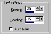
The spacing between the rows in the first sample is far too wide. Adjusting the leading will tighten the rows. |
Line spacing
|
|
Keystrokes for Typographer's quotes:Use the number pad and hold the ALT key down until you have typed in all the numbers. ALT 0147 for opening quotes
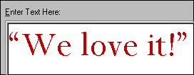
A few extra steps gives a perfect look to quotes.
Turn the grid on for perfect character alignment. |
Typographer's quotes You also get a great look when you align multi-line text with the quotes outside the alignment point. In the sample at the left, the top quote is as typed with kerning and leading adjustment. But look at how much better the second sample looks. Create your text with line breaks, kerning and leading as close to final form as possible (you will often make some fine adjustments once the final placement is complete). Add one or two spaces to bring the first character in the second row close to aligned with the first character in the upper row. You will only get close with this most times. Insert your cursor just ahead of the first character in the second row and enter a positive kerning value to move the line to the right or a negative value to move the character to the left. You must return to the document to check the alignment. For perfect results, select View>Grid to turn the grid on to check exact alignment. And that's all there is to it. Well, that is all there is to the mechanics of typography in PaintShop Pro. You owe it to your designs to study professional techniques. Make sure you check the resources at the end of this tutorial. If you are interested in using text as a graphic element, make sure you see Text as Design.
|
|
|
|
Type Right for a Pro Look Tutorial IndexType Right for a Pro Look Start
|


 To
adjust the spacing between lines, select the Vector Object Selection
tool and double click on the text to open the Text Entry window. Highlight
all the text and specify a negative number as the leading value to reduce
the leading, or a positive number to increase the leading.
To
adjust the spacing between lines, select the Vector Object Selection
tool and double click on the text to open the Text Entry window. Highlight
all the text and specify a negative number as the leading value to reduce
the leading, or a positive number to increase the leading. 

 class
to a pull quote. Simply place your cursor where you would like to add
the quote and type in the appropriate characters from the list on the
left.
class
to a pull quote. Simply place your cursor where you would like to add
the quote and type in the appropriate characters from the list on the
left.
URL: https://www.webreference.com/graphics/
Created: May 8, 2000
Revised: May 8, 2000
 Find a programming school near you