Type Right for a Pro Look pg 2: Production Graphics with Wendy Peck at webreference.com
 |
Type Right for a Pro Look: Controlling Text Position | |
|
Blue line represents baseline. Lower text has been raised 10 px from the baseline.
|
We have talked about leading (line spacing) and kerning (character spacing) but there are other controls you will need to perfect your typography skills. Again, I would like to urge you to follow up on this topic, since I am not intending this lesson to be a typography course. In fact, this amount of information could only be considered an introduction. I simply intend to give you the tools to implement professional typography. We are working with graphic programs, which are very different from page layout programs where most typography is accomplished in print design. In addition to moving characters and lines in relation to other characters and lines, you will also want the ability to move letters in the same word or phase up or down. I will cover a few examples of where you would move the characters (shifting the baseline) but there are many other appropriate reasons to use this shift. The baseline is the line where the bottom of the characters line up. Letters like "y" or "g" have descenders, which is a portion of the letter that falls below the baseline. At the left, the top sample is created with a default baseline position and the blue line marks the baseline. The second sample is the same text, but the baseline has been shifted by 10 pixels. |
|
|
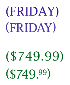
Initial cap created with font size and the baseline of the rest of the word has been raised.
Kerning and baseline adjustments create the second version from the first for professional appearance. |
In this sample, I have created an initial cap effect within the same text entry. The font size for the initial cap was increased and the baseline changed for all other characters to align. I also did some kerning with the entire word, as well as the individual characters. Note how the "r" crosses into the area of the initial cap. The baseline shift is an important part of creating well crafted typography. See the two samples at the left. In each, the top version features default settings. In each lower sample, the entries have been carefully nudged into correct form with kerning and baseline shift. For the "Friday" sample, note how the parentheses are not in the middle of the word. A slight adjustment to the baseline for each of the parenthesis corrects the balance. Character spacing was tightened between the "F" and "R" and for both the "A" and "Y". You could certainly "get away with" the top sample, but look at how much better the lower sample looks. The changes are even more dramatic in the price sample. Again, we raised the parenthesis baselines by a small amount. The entire entry is kerned heavily, with the "7" and "4" receiving even more to take advantage of the nesting shapes. The "99" was reduced in size, with the baseline raised to match the top of the other characters. It is hard to argue with the value of good typography when you see the difference between the original and the one which uses typography methods. |
|
|
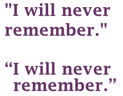
Top line: Keyboard characters.
Top version is default values. Bottom version has correct quote form, aligned text and reduced line spacing. |
Typographer's quotes The PC keyboard shortcut to create the quotes in any program is ALT 0147 for opening quotes and ALT 0148 for the closing quotes. Single opening quotes are ALT 0145 and closing ALT 0146. For the Mac the keyboard shortcut is OPTION SHIFT [ for opening quotes and OPTION SHIFT ] for the closing quotes. Single opening quotes are OPTION [ and closing OPTION SHIFT ]. Again, I have created a sample with straight typing and one with typography adjustments. The correct quotes are much more attractive than the typed quotes. Observe how much difference it makes to align all the text and allow the quotes to stand outside the text. For the small amount of text we are working with as graphics, it is easy to achieve this look simply by inserting a space and adjusting the kerning of the space until the text lines up. I also reduced the line spacing to create a more unified appearance. Typography is often seen as as a perfectionist obsession, but when you see the difference a little work can make to a page, you will never treat type casually again. You can carry on to the software section now and learn how to do the techniques described above. Just before we move on though, I would like to leave you with some food for thought. I see a lot of great sites in my travels, but I see far more that incorporate one or all of the characteristics that I believe ruin otherwise fine sites. |
|
|
|
Typography practices that scream "amateur" In addition, you should watch for the following: Too many fonts: Unless you are highly skilled with typography, restrict yourself to using no more than two font families on a page. You can use bold, italics (with a very light hand), varied sizes and colors, even black, condensed or light versions of the family, but it takes a lot of experience to create a unified page with several different font families fighting for attention. All Caps: ALL CAPS IS TOO HARD TO READ. Period and end of discussion. ALL CAPS WITH BOLD IS WORSE. You may be able to use one or two words or a headline with some fonts, but if you are new to thinking about typography, stay away from this style. Centered Text: Centered text is hard to read as a paragraph and often quite boring and predictable as a headline style. Try left and right alignment for headlines to liven up your pages. I am not suggesting that you are an amateur if you use a centered headlineit is a valid optionbut try the other options first. It is easier for the eye to start at the left and jump down, or start at the right and continue on with the next line. |
|
Type Right for a Pro Look Tutorial IndexType Right for a Pro Look Start
|


URL: https://www.webreference.com/graphics/
Created: May 8, 2000
Revised: May 8, 2000
 Find a programming school near you