Type Right for a Pro Look pg 6: Production Graphics with Wendy Peck at webreference.com
 |
Type Right for a Pro Look: Fireworks Typography | |
|
|
|
|
|
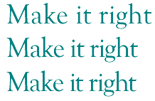
The top line of text has default values. The second line has has range kerning applied to tighten the spacing across the phrase. The final sample has been fined tuned by kerning individual character pairs. The top phrase looks fine until you compare it to the final sample with the letters forming a solid unit.
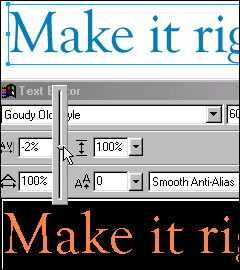
Position your Text Editor window so you can see the document view of the characters you are adjusting. Changes are not affected in the Text Editor window, but do show as you make changes in your document view. |
Fireworks has wonderful text control capabilities for typography. Spend a little time learning these few techniques, read up a little on typography methods, and you will be easily adding professionally designed text to your pages. (If you are looking for a more artistic style of text, you won't want to miss Text as Design.) The first task with almost any display text is to tighten the character spacing. Occasionally, we want to open it up, but that is a style decision. If you are creating text that is designed to be read easily, and look great at a large size, you will be reducing spacing. In the sample at the left, the first line was created with default settings. The second line has had character spacing, or kerning, applied to the entire phrase, and the third has has minor fine adjustments to a few letter pairs. The final example has more impact, since the characters are holding together as a unit.
With your pointer tool, select the text you wish to modify and double click to open the Text Editor. For range kerning (adjusting the spacing between two or more characters), highlight all the characters you wish to adjust. You should adjust your Text Editor window position so you can see the text in your document at the same time. There is no real time preview for kerning within the Text Editor window, but changes are reflected as you work in the document view. (See setup at left). Use a very light hand with these values. You may wish to type the numbers instead of using the slider once you are familiar with the values you will require. Once you have your range of text adjusted, you will almost always have to adjust one or two character pairs individually. Simply place your cursor in the space you wish to affect, and set the slider to (or type) the correct value. With the real time view and the dual function of the kerning command, you can quickly add a professional touch to your type. |
|
|
|
|
|
|
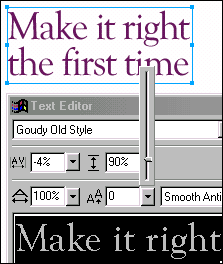
The first sample above has default leading, or line spacing, which is just a little too large. The lower sample has been adjusted to 90% leading, and gives a more unified feeling to the lines of text.
|
Line spacing or leading To adjust line spacing, choose the Pointer tool from the toolbox and double click on the text you would like to adjust. This opens the Text Editor window. Position the Text Editor window so that you can see your text in the document. The Text Editor window does not provide a real-time view of the changes you are about to make, but it is reflected in the document as you work.
These values can be adjusted at any time, which is often necessary. Once you have adjusted your leading, you may wish to change some of your character spacing. Every font, and every character pair in every font can behave in a different way. The more you learn about typography, the more you will be able to make these adjustments by instinct. It takes a little while to get to that point, but if you are persistent, these techniques will add very little time to your work, and will make a world of difference in the final appearance. Carry on to the next page to learn about shifting baselines and creating typographer's quotes. |
|
|
|
|
|
|
|
Type Right for a Pro Look Tutorial IndexType Right for a Pro Look Start
|

URL: https://www.webreference.com/graphics/
Created: May 8, 2000
Revised: May 8, 2000
 Find a programming school near you