Into the Shadows: Production Graphics with Wendy Peck at webreference.com
 |
Into the Shadows: Isn't a Shadow a Shadow? |
|
 |
Isn't a shadow on a graphic, just ... well, a shadow? Not even close. There are so many varieties of shadows that we will not even be able to cover them in this tutorial. I will be leaving one whole class of shadows, the perspective shadow to a second article. We will spend this whole time talking about ... plain old shadows. I touched lightly on shadows in Photoshop Layers: The Freedom Tool a while back. Photoshop users should make that their first stop, since I am assuming you have the concepts and ideas presented their for this tutorial. Also, another note for Photoshop users. I am now using Photoshop 6 to prepare these tutorials. However, have no fear if you are still using version 5.5. For the next few months, I will create double instructions if I am describing a technique that differs between PS 5.5 and 6. Since my topics are usually not based on special effects of any kind, the main difference will be in the screen shot appearance. I am a long way from assuming that every user now has Photoshop 6. On the other hand, I do have my eyes open for places that version 6 can save you time, and will not hesitate to include that information for those of you who have the upgrade. |
|
|
Three identical images with only shadow changes. Note how the default shadow, the bottom example, flattens our ball to a button. |
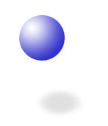
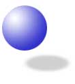
Just the basics The most serious error designers make with shadows is thinking of it as an effect, and not representing something real. Shadows are used as a way to "raise" an object from the page. They trick our eye into believing that the object we are seeing is actually above the surface of the page or screen. When you see a page that seems to be alive with depth and dimension, you will, without exception, be looking at expert shadow work. The designer understands what a shadow is all about. And a shadow is about light. Light falls on a three dimensional object and creates a shadow. But unless you have a 300-watt, bare light bulb pointed at an object, you are not likely to have a create a shadow that resembles the default setting in most graphics programs. Let's take a look at the blue balls at the left. The final image has been created with the default shadow. It looked more like a ball when it had no shadow. In fact, this shadow has flattened it to looking like a button. I suppose if you brought a bare light down to almost touching a ball, you may get this effect, but certainly no other situation. Notice the ball at the very top of the page and the one just above our flattened one though. Now we are working with effects that our eye can translate properly. In the first example, the ball appears to be floating far above the surface. In the second example, the ball seems to be just slightly above. But it is not only distance from the surface that is creating the illusion. Compare the two shadows. The shadow that is a long way from the object is lighter and slightly larger. When the ball is closer to the surface, the shadow is more defined and a little distorted. If you are interested in creating life-life shadows, and in my opinion, if you are going to use shadows, you should, then you should start watching for how light and shadow work together. When the light is close, what does the shadow look like? When the light is soft, what happens to your shadow? If you are really serious about adding dimension to your art, you
should spend some time learning light principles from the traditional
art world. We may have filters that do everything but dance, but they
are not always so smart. If you understand the way that light works,
you will be able to use the immense power of programs and plug-ins
to create work that will compel all who view your work. The time is
well spent. |
|
 |
At the very least, even if your interests do not range to producing "art," the next time you go to add a shadow, stop. Stop and ask yourself what you are trying to accomplish. If the answer is that you want to make something "look more interesting," you are making a mistake. If instead, you can answer that you want to make this image appear to be three dimensional with your light source coming directly from the top onto a white surface ... you're probably on the way to a great effect. Let's move on to take a look how to manipulate your shadows. |
|
|
|
Into the Shadows Tutorial IndexInto the Shadows: Isn't a Shadow a Shadow? |
URL: https://www.webreference.com/graphics/column38/
Created: October 26, 2000
Revised: October 26, 2000


 Find a programming school near you