Graphic Lifts pg 7: Production Graphics with Wendy Peck at webreference.com
 |
Graphic Lifts: Using Graphics to Shape Color Blocks | |
|
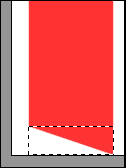
All of the shapes above can be achieve with a tiny GIF file containing only the shape part of the design. The red dotted line in the lower sample shows where the GIF ends and a table background color takes over. |
How can you avoid graphic heavy pages but still get the motion into your design? How can you avoid nesting 10 tables to get the color where you want, or a graphic behind your text? Think in pieces! Web design can be a painful exercise... you see the perfect graphic solution, but you just can't get it into the page, especially if you are trying to create "liquid" pages, which go from edge to edge no matter what the viewer's monitor resolution. But if we think in terms of shapes, the answer will often appear. This section could have a heavy HTML component to it, but it won't. First, there are too many difference in how designers create HTML some never do code, and simply must be aware of the limitations. Second, that is not my area of expertise. If you are looking for coding information, click on experts above and choose the skill you would like to develop. My colleagues are the experts in the coding world, and that is where that instruction should stay. We are looking strictly at how to use graphics to extend the look that HTML alone can produce. |
|
|
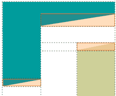
From filled blocks to design with three GIF files. The tan colored boxes here outline the pieces of this design that will be exported as GIF files and added to color blocks from table and cell backgrounds. |
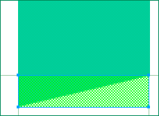
One tiny technique that I have seen used often, but not as much as I would expect, is the placement of a GIF file to create shape at the edges of a table cell with background color. You can get a lot of graphic impact for a tiny graphic file. The thing to watch from your earliest design stages though, is table layout. I have boxed myself into some impossible situations, so if I am using this now, I make sure that I also set up a grid or guidelines to represent the table breakdown. In any program, you can turn the grid or guides on an off, so you do not have to design in the midst of structural distractions, but do check often. There is nothing worse than tucking an innocent piece of text into an area, falling in love with the look, and then realizing you would need three nested tables, all with column and row spans, to achieve it. At the left, you will see three similar samples. In the first, a blocky example of a common layout. The information can be found in a layout like this, but it is predicable and dull. The second sample shows what can happen with the simple addition of a few angles. Add the text and a few graphic enhancements and you will have a pretty nice looking page with some interest and energy. The difference? Check the third sample to see the structure for the GIF pieces. Realistically, The top portion of the upper shape would be a graphic anyway, including navigation, logos, etc. Shape is not hard to put into a left menu as well, if you are doing mouseovers, etc. However, I wanted to show several different angles and pieces, just to show how they can work. The semitransparent rectangles represent the GIF file and the dotted lines show the necessary table structure. Below, I have included each of the resulting GIF files, just to make sure all is understood before we go onto how to create the GIF files quickly.
This is a simple sample, but there is no difference cutting the shaped graphics from a texture pattern. You will have to be careful not to use a pattern with an obvious repeat, but for overall textures you can often allow your small graphic to handle the shaped area and use a table background image to cover a large area with a small tile. GIF files with Web safe color are quite predictable, but if you are using a pattern, especially if you are using JPG format, make sure you are consistent with compression levels and any other adjustments you make to each portion. |
|
|
|
Graduated headings are also naturals for this technique. Create a small area filled with a gradient fill, and set it at the start of a colored background cell. The top sample at the left shows the finished appearance, and the lower sample has a pink outline added to show where the graphic stops and the background color takes over. | |
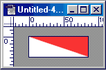
Cutting a piece from a larger graphicEach program handles this operation in a slightly different manner. Raster programs use selections and copying to separate a small section of the image. Vector programs are a little more complicated. Be very precise at this point, using guides to ensure that you are on to the pixel. Even a one pixel error can show very clearly. |
||
|
|
Raster programs Select the area you wish to save and copy. Photoshop, choose File>New and the dimensions of the section you just copied will be presented. Accept this setting and paste the portion. Save as for any file. You can also take it into ImageReady and draw a slice over the exact area you require. Save the slice. PaintShop Pro: Choose Edit> Paste as New Image and save the new image as usual. |
|
|
|
Vector programs Fireworks: Use the Slice tool and draw a slice over the exact area you require. Choose File>Export Special>Selected Slice to export the shaped piece only. |
|
|
|
|
|
 |
Freehand
|
|
| And that's it! Another set of basic tools that will help you to reach your goals with reasonable production time. I hope that you will take each of the ideas and stretch it well past where I have gone here. All I have provided are a few ideas and, for some of you, new methods to accomplish some of the ideas. Have some fun, and be creative ... there is no feeling that quite equals defeating a design problem with a super simple solution. | ||
|
|
Graphic Lifts Tutorial IndexGraphic Lifts Start
|


 CorelDraw:
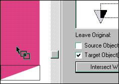
Use the Intersect function. Draw a rectangle with no fill over the exact
area you desire. Choose Arrange>Shaping>Intersect from the main
menu. The Shaping palette will open. Select the rectangle. Make sure
the Intersect button is depressed (see here) and activate the Leave
Original: Target option. Click anywhere on the original shape and a
copy of just the area covered by the rectangle will be placed on top
of the original. Select the new graphic and export as usual.
CorelDraw:
Use the Intersect function. Draw a rectangle with no fill over the exact
area you desire. Choose Arrange>Shaping>Intersect from the main
menu. The Shaping palette will open. Select the rectangle. Make sure
the Intersect button is depressed (see here) and activate the Leave
Original: Target option. Click anywhere on the original shape and a
copy of just the area covered by the rectangle will be placed on top
of the original. Select the new graphic and export as usual. 
URL: https://www.webreference.com/graphics/
Created: July 20, 2000
Revised: July 20, 2000
 Find a programming school near you