Graphic Lifts pg 6: Production Graphics with Wendy Peck at webreference.com
 |
Graphic Lifts: Tie It All Together with Lines | |
|
|
You will find a whole tutorial dedicated to the "how-to" of creating create lines in graphic programs: Let There Be Lines. In this section, I would like to take the time to look at why lines can be so valuable. In a nutshell, lines are like markers to direct your visitors. In some cases they will act as stop signs. In others, they will take the visitor by the hand and lead them where you want them to go. But no matter what action lines cause, they also have a secondary role. Without dividers and direction, our eyes will wander all over the page. Lines can help elements feel more solid on the page as well. As an example, look at the samples to the left. In the upper sample, the graphic is lined up neatly with the text , and forms a spot for the eye to rest. The second sample is identical, with the addition of a line. Notice how the graphic and headline now form one unit much more the intended purpose for the graphic. In the first sample, our eye is stopped and we will then move naturally to the headline. But in the second, we stop and focus in on the headline in one movement. That is the power of lines and one we can ill afford to ignore to provide the best result for our clients. |
|
|
|
|
|
|
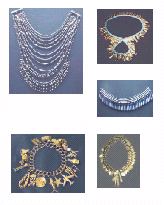
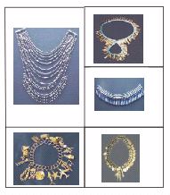
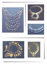
Images have no anchor ... nothing to hold them together.
A table with visible borders anchors the images, but the look is static and the varied shapes and sizes are more evident.
The images are anchored by the stylized lines, but seem to be part of a "design" rather than just placed. |
As an Anchor Try, instead, using lines to tie graphics together and anchor them on the page. These samples were roughly put together as an example. Notice how the first sample at the left has nothing to balance the varied sizes and shapes and seem ... undisciplined might be the right word. The second sample has been pulled into some order with a visible table border arrangement, but it is very dull, and the varied sizes and shapes are now more out of place. Finally, study the third sample. Although this is still not refined nicely (I would like to see at least a hint of a shadow on the images) I think it is much more orderly than the first sample, and presents more style than either of the other versions. The table structure would be similar for all versions. Dividing lines are simply a beginning. Groups of objects can be placed in a table with a background of multiple, subtle lines to clearly identify the product area. A line coming from the left at the top, and one coming from the right at the bottom of a product section can be enough to provide an anchor. Make sure you check out Let There Be Lines for more ideas and all the techniques. Test Your Page Balance and flow For obvious reasons (unless your eyes are a lot better than mine) this is not as effective with a subdued design or a monochromatic color scheme. For that situation, you can use the print world technique of squinting your eyes until you can only see forms rather than details. You can also try crossing your eyes, though I have not had any luck with this on a monitor (but I am serious this is also a time-tested balance check for print work). Any of these techniques are best practiced either very subtly, or when you are alone. Our reputations are often right on the edge simply for the amount of time we are at a computer, and enhanced by the occasional conversations with our screens. Crossing our eyes or studying intently as we walk slowly backwards from our desks may not be seen in the right light by your coworkers. . |
|
|
|
Graphic Lifts Tutorial IndexGraphic Lifts Start
|

URL: https://www.webreference.com/graphics/
Created: July 20, 2000
Revised: July 20, 2000
 Find a programming school near you