Color Power with Gradient Fills: Production Graphics with Wendy Peck at webreference.com
 |
Gradient Fills: The Full Picture |
|
|
Top sample saved as a JPG at medium quality. (.84kb) Lower sample is the same file, but saved as a high quality JPG (1.98kb). The compression helps to smooth banding in this case.
Although banding is almost invisible in this sample of a medium quality JPG, artifacts are ruining the text.(1.82kb)
Changing the JPG compression to high quality adds some subtle banding, but the text is clear. (2.89kb)
The same sample as above, but light noise was added to the graduated fill layer. A low noise setting was applied four times and the banding is less pronounced. (2.98kb)
GIF file of the same button. The file size is nearly double, and the quality is not quite as good as the JPG. GIF occasionally delivers excellent graduated full results though keep it in mind. (4.43kb) |
There is nothing that will give your graphics more impact than correct use of graduated fills. All graphics programs offer these fills in one form or another, but few people actually take the time to investigate all the options for bringing graphics to life. Take a look at really great sites, though, and you will find that gradient fills are everywhere often subtle, and only evident when you really study the graphics. Study anything that seems to have wonderful depth or a feeling that it is beautifully crafted, and you will often find that gradient fills are providing the special qualities. In order to use the power of a gradient fill, you must spend the time to learn what features your software offers for these special fills. The learning is not so tough, since this is not a mysterious tool. However, you should devote some time to playing with the various settings so you understand the effects that each type of gradient delivers. We will start with a very simple explanation of the basic types of gradients fills and then move to software specific discussions. This is one topic that is very different depending on which software you use. General Tips on Gradients I will probably get mail on this, but you have to work within the restrictions of the medium. At high resolution, as is used for printing, it is much easier to deliver a gradient without banding, or lines of color when we really want a smooth transition. Getting a smooth gradient fill at Web resolutions is not an exact science. For example, take a look at the samples at the left. This solid graduated fill is smoother in the first sample. Yet they are saved at 30 quality and 80 quality JPG files, with the top sample at 30. Increasing compression helped to smooth banding. The banding problem will not be as great for shaped images or text as it is for solid fills. Smaller areas like buttons, also take well to graduated fills on the Web. However, along with the benefits of broken areas come the challenges of artifacts around design features. See the sample of the buttons at the left. While the graduated fill in this button looks smoother at the lower quality (30) it is broken up around the letters. The lower button has a slightly more noticeable banding, but the letters are clear. Of course, this button is an exaggerated size, which makes any problems worse. The samples above point to the one rule of graduated fills for web use - there is no "right" way. I have done fills with two colors that I could not force to band. Others, I have had to resort to masking to achieve acceptable results. You can also add noise and/or blur the graduated fill to reduce banding as in the third sample button. Most samples are better when saved as JPG format, but I have had times when I achieve a better result saving as a GIF, even with less than 256 colors. Dithering the GIF file can help to reduce banding. Your file size will most times be considerably larger for a GIF, unless you are using a vertical graduated fill, but for small areas, the quality result may be worth the extra size. I have found text with a graduated fill is often best exported as a GIF. |
|
|
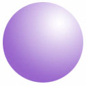
Radial gradient fill. Noise added to reduce banding and exported as JPG. Before I added the noise, this sample was banding badly for every export setting.
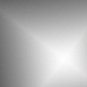
Diamond gradient fill. Maximum quality JPG offered a very smooth result at one third the file size of a poor quality GIF export.
Mesh gradient (vector programs) fill used as a background. Exported as JPG. |
Linear Gradients: This is the most common gradient you will find, and is usually the default setting for a program. The samples in the previous section are linear fills. You can set the angle the fill will be applied, but it always moves from one point to another Radial Gradients: Fills that blend from one color at a central point to another at the edge of the object. All programs with gradient fills offer a radial fill. Specialty Gradients: Many programs offer more than radial and linear fills. Square and conical are common offerings. Illustration programs often have very intricate blend and gradient fill capabilities, like the mesh gradient offered by Adobe Illustrator and CorelDraw. This fill allows you to specify many colors and fill positions along a grid pattern. Gradients can be used to add life to your work. Experiment with them for each project. When you are designing your project, test your fills very early. At times a slight color shift can give you much better results and far smaller files sizes. I have made the mistake of sketching my entire project out in a vector program without testing export quality. As always, Murphy's law kicked in, and a direct order from God would not have given me acceptable results for that particular gradient color combination to export to the Web. Test early, test often when you are working with gradients. But do it! Your work will take on a dimension that you cannot achieve in any other way. Carry on to learn about gradient fills in your software. Unless you are a gradient junkie, my bet is that your program can do much more than you know. This time we will look at Photoshop, PaintShop Pro and Fireworks. Come back next time to learn about gradient fills in Illustrator, Freehand and CorelDraw. |
|
|
|
|
|
|
|
|
|
|
|
Color Power with Gradient Fills Tutorial IndexColor Power with Gradient Fills Start |


URL: https://www.webreference.com/graphics/
Created: May 27, 2000
Revised: May 27, 2000
 Find a programming school near you