Rough it Up pg 8: Production Graphics with Wendy Peck at webreference.com
 |
Rough it Up 8: Background Textures with PhotoShop | ||
|
I've noticed a lot of new sites with textured backgrounds in my regular trips around the Web. Not the old, "in your face" backgrounds that we left behind a while ago, but subtle and demure, like fine paper, or designed to fall truly into the background behind plain colored or white tables. I suspect that designers may be using backgrounds to fill in white space for viewers with high resolution monitors (or I may be completely wrong, and they do it because it looks great when well done). Luckily, the textured backgrounds I see in commercial sites are easy to produce with photo manipulation software. I am only going to cover a few basics this time, as the topic relates to our rough theme. In a future tutorial, I will take a deeper look at backgrounds, how to use them, and how to create your own with both vector and photo manipulation programs. |
||
|
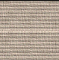
The secret to creating seamless texture in PhotoShop is the Offset filter. It will wrap your edges into the middle where you can edit any seam lines that have appeared. This unleashes unlimited potential for creating textured backgrounds. To create a texture similar to the one shown at the left, create a new document, 100px by 100px in size. Fill with a taupe color. I don't fret as much about Web safe colors when I am going to be creating a texture. The Web safe color will not be retained through the filtering process, and dithering or color shifts are less noticeable in a textured graphic. But a warning: If, like me, you lust after the rich, elegant taupe family, be prepared to have them turn quite pink in a few browsers. Gray taupes seem to be less prone to this shift. |
||
|
The line in the center of the image appears when Offset filter is applied. There is also a slight vertical seam, but we will repair the horizontal one first.
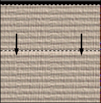
Selected area moving to cover light line. Arrows represent direction of move as well as the approximate final position for selected area.
Pasted copy is moved to cover the vertical seam. It will come to rest, aligned to the horizontal pattern, just below the edge top edge. Never make adjustments at the edge of the tile as you may lose the seamless effect. |
Create a texture Add the texture by selecting Filter>Texture>Texturizer from the Main Menu. Set Texture to Canvas, Scaling 53, Relief 3 and Light Direction Top Right. We are ready to create the seamless tile now. Make sure you have completed the look you want, since any changes can affect the seamless quality of your image. Create a Seamless Tile Note the light line running from side to side in the middle of the pattern, and a faint alignment line running up and down on the vertical center. To repair the horizontal line, I selected the top half of the image to the bottom of the last line before the light area. I then selected the Move Tool and used my Down Arrow key to move the section down over the lighter color. You may want to turn off the marquee borders (CTRL H) to see when you have perfect alignment. In the sample shown here, the section is about halfway through the move. Carefully crop the background area that results from moving the texture down. You can often blend seams with the Rubber Stamp Tool, but in this case it did not create a clean line. I selected a small section from the image and copied it. I then pasted it into the image and using the Move Tool, moved it into place over the line, matching the horizontal lines (see pasted area at the beginning of the move in the bottom sample). Repeat as many times as needed to create a seamless appearance. It is usually best to copy a few different areas so you do not create a new seam. This is also why I selected only a portion of the image, rather than trying to cover the seam in one step. Merge the pasted selections down.
As a final note. To create a transparent GIF for the text placement on the samples above, I used an alpha selection to specify the transparent area. I will include this method in a future tutorial, but in case you are trying to get a perfect transparency on a textured background before then, look to alpha transparency for the solution. |
||
|
|
Rough it Up Tutorial IndexRough it Up Start |
URL: https://www.webreference.com/graphics/
Created: Mar. 3, 2000
Revised: Mar. 4, 2000


 Set
taupe as your foreground color and black as the background color. Choose
Filters>Sketch>Halftone Pattern from the Main Menu. Set Size 1,
Contrast 0, Pattern Type Line. Click OK. Immediately choose Filter>Fade
Halftone Pattern and set Opacity to 34%. Your document should look similar
to the sample here.
  Find a programming school near you