Rough it Up pg 5: Production Graphics with Wendy Peck at webreference.com
 |
Rough it Up 5: Coloring Outside the Lines | |
|
|
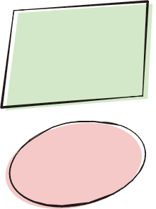
Who says that outlines and fill have to line up? This is one look that can be quite professional, yet always presents a fun and friendly image. Not hard to do, since it is simply a stylized outline placed over a duplicate object with fill and no outline. The trick is to make it look deliberate without allowing it to look out of control.
You must duplicate the shape before you apply styles to the outline.
Select one of the shapes. Choose Arrange>Convert Outline to Object
from the Main Menu. Once you have your outline completed, choose a fill color for the second shape and specify no outline. Bring the outline to the front if necessary, and place on top of the filled shape, allowing just a sliver of the background to show. Leave too much space and you will lose the visual connection between the fill and the outline, but too little and it looks like a careless mistake. The oval is completed in exactly the same way, but the distortion is
done with through the skew command. |
|
|
|
Just a note from the front page. The method described above for distorting the rectangle is exactly how I accomplished the colored shapes on my Web site. I created roughly the shapes and colors I was looking for, and put them into place. I then fine tuned the balance with the varied shapes. Very easy! If you like the more casual look, you owe yourself some time experimenting with the Artistic Media tool and trying new combinations with fill and outline. It not only adds a friendly tone to your work, but it is just plain fun. |
|
|
|
||
|
|
Rough it Up Tutorial IndexRough it Up Start |
URL: https://www.webreference.com/graphics/
Created: Mar. 2, 2000
Revised: Mar 2, 2000


 You
will rarely see a similar look to this with symmetrical graphics. For
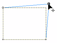
the rectangle sample, I first drew a rectangle and converted it to curves.
Using the shape tool, I pulled two corner nodes out of line to give
it a crooked look as shown here.
  Choose
the Pick tool from the Toolbox and select the ellipse Click again to
bring up the rotation and skew handles. Click on the top center handle
and drag it to the right to distort. In some cases, you may also want
to rotate the shape to get the effect you desire. Complete as for the
rectangle.
 Find a programming school near you