Size and Proportion in Web Graphics. Small graphic examples
| Small graphic examples |
|
Let's start with a fairly typical "Powered by" button that I designed for Quiotix Corporation, the creator of the Quiotix Embedded WebServer (QEWS). This 88x31 image was intended to display the text "Powered by QEWS" and, ideally, the Quiotix logo. The first natural idea was to use the design themes of the company's web site. Thus, I copied a fragment of the cloudy background and the yellow "QEWS" title and composed the first draft shown on Fig. 5, a. The only new element here, the "Powered by" line, is an analog of the secondary headings on the site's subpages; refer to last month's discussion to get an idea of why that line is all-uppercase and spaced out. If you have carefully read the previous sections, you can quickly spot the mistakes in this design. First, the photo wouldn't work in such small a size---it doesn't convey the idea of "clouds," but only works as a visual distraction (as would anything that is unclearly seen and difficult to identify). Second, the drop shadows and the too bright color of "QEWS" damage the recognizability---and even legibility---of the text on the button. These mistakes are directly related to the small size of the final image; Figure 5 makes it obvious that the same button could look much better in a bigger size. Thus, in the next iteration I abandoned any photorealism attempts, and tried instead to fit the Quiotix logo into the composition. Here, another characteristic mistake of small-sized designs should be pointed out: Even in things as tiny as this one, a title doesn't need to occupy all the room to be visible, because visibility of an element depends on many factors besides its size. In this case, my predetermination that the "QEWS" title should be as large as the space allows led me to searching for a good way to overlay the logo and the text, and one of such variants is shown on Fig. 5, b. Again, unfortunately, such a layout turned out to be hardly reducible, as is nearly any layout based on overlaying elements. The fact that the text goes in part over a white background and in part over a rather dark logo makes it extremely hard to read in small sizes. Also, although the central part of the logo fits well into the rectangle, I couldn't claim that the original logo was easy to recognize in this composition. Finally, as I mentioned before, symmetric designs are subjectively perceived less in size than asymmetric ones of the same dimensions---which, given the scarce room limits of the case, provides another argument against this layout. |
 n this last section, I'll show you a couple of
examples from my own recent design practice to illustrate the layout
and proportioning problems typical for small-sized web graphics.
n this last section, I'll show you a couple of
examples from my own recent design practice to illustrate the layout
and proportioning problems typical for small-sized web graphics.
| a |  |
 |
| b |  |
 |
| c |  |
 |
| Fig. 5: The saga of a button (zoomed-in views on the left, actual sizes on the right) |
|
The version that was finally approved by both customer and myself is
shown on Fig. 5, c. As you can see, compared to its
predecessors it is significantly simpler in some aspects and more
complex in others. It is not symmetric, and the pieces of text
pressed against the edges visually "push the limits" of the frame
making at appear a bit larger than it really is.
The composition is based on dividing the rectangle into four lesser rectangles contrasting light and dark (bottom and top) and cold and warm (left and right) tones. This is one of the few layout effects that could, thanks to their simplicity and linear nature, work in so small a size. The color of the "QEWS" is the same as that of the logo's visual, although to make it appear the same I had to darken it a bit. As for the logo, I still couldn't fit it there in its entirety, especially since I was asked to use it along with the company name. The way of cropping the logo that I used here maintains some level of recognizability, and at the same time presents the logo in an unusual and entertaining way (for those who have seen its canonic form, of course). I couldn't completely turn off anti-aliasing for the "QUIOTIX" in the logo for the fear of a style clash with the rest of anti-aliased image, but I had to somehow "de-anti-alias" that fragment by manual pixel editing to make the company title legible. For another example, consider the small stylized book icon that I created for an online bookstore (this image is displayed for the books for which cover scans are not available). The outline of the drawing was clear from the beginning, but there were a couple of size-related surprises lurking on the way, because of the image's thumbnail size (40x60 pixels). |
| a |  |
 |
 |
| b |  |
 |
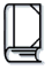 |
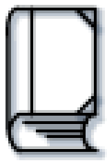
| Fig. 6: Designing a pocket-size edition |
|
As shown on Fig. 6, a, the initial book drawing (leftmost column) displayed three "pages" on the bottom edge---which looked just fine in a large scale. However, when reduced to its natural size (middle column) and provided with a light blue drop shadow (necessary to match the overall site design style; unlike texts, simple images in small sizes are sometimes improved by moderate drop shadows), the uniform equidistant arrangement of these lines was suddenly broken. This pixel-level effect is easy to explain, and here it just visualizes the main design flaw of the composition: For such small a size, the bottom of the drawing is way too thick. It's no wonder you just don't have enough pixels to render three more-or-less uniform lines there. The same book image tweaked for better size reduction, as shown on Fig. 6, b, has only two "pages," features enlarged "cover corners," and uses a more moderate shadowing. The magnified small version (rightmost column) shows that in the new version, the lines at the bottom are spaced just right for the pixels to form distinct and uniform lines. |
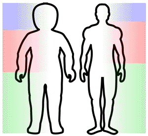
| Fig. 7: Learn from Nature: The human body suggests correct proportions for things small and big |
|
The two versions of the book icon reminded me of a well-known phenomenon: The proportions of the human body change as a person grows older---and bigger (Fig. 7). A toddler's body and limbs are more uniformly proportioned, with a larger head and shorter legs than those of an adult. Analogously, in a small composition you need to make its parts more level (although not necessarily equal) in size, while in larger designs you could employ more expressive, outspoken size relations. |
Revised: Nov. 22, 1997
URL: https://www.webreference.com/dlab/9711/examples.html
 Find a programming school near you