Size and Proportion in Web Graphics. Limits and proportioning
| Limits and proportioning |
|
Vertical space is scarce, too. Although you can, theoretically, produce pages of any length, the effect of your information drops very quickly as you move down the page, especially as you leave the prime space of the first screen (which is about 350 pixels high on the cheapest computer monitor and 376 pixels on WebTV). People aren't crazy about having to scroll pages vertically (although they hate horizontal scrolling even worse), and it sometimes proves more efficient to break a large material into a number of short pages. |
 he current gap between high- and low-end
computer video systems, combined with the unscalability of bitmap
graphics, are responsible for the rigid size restrictions imposed on
web pages. To fit within the screen resolution of most
monitors, the width of a page should not exceed some 580 pixels, and
even less---544 pixels---if we are going to cater to WebTV users
(who, in addition, cannot use horizontal scrolling).
he current gap between high- and low-end
computer video systems, combined with the unscalability of bitmap
graphics, are responsible for the rigid size restrictions imposed on
web pages. To fit within the screen resolution of most
monitors, the width of a page should not exceed some 580 pixels, and
even less---544 pixels---if we are going to cater to WebTV users
(who, in addition, cannot use horizontal scrolling).
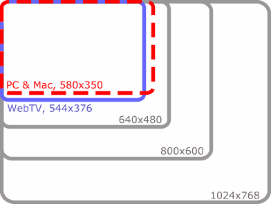
| Fig. 1: A chart showing relative sizes of the browser display areas on low-end PC and Mac monitors (dashed red line) and WebTV (blue line) vs. the common PC screen resolutions |
|
So, designers have to find their ways around these space
limitations---not by disregarding them, of course, but by learning
to create designs that fit comfortably into the limited space.
Fortunately, their efforts are greatly assisted by the
incredible flexibility of our visual perception.
Our eyes are highly efficient in determining the size of a rectangle with relevant information and successfully accommodating to it. After a very short while, we are no more disturbed by a web page being significantly smaller than the whole screen. An image of some 400x200 pixels seems really huge in a browser window---while the same would look tiny in a graphics program with its window flung open on a 17" monitor. This accommodation capacity could be compared to the lighting adaptability of human eye, which is a constant concern for photographers. Scenes that are mildly and quite discernibly lit to a human eye, are often too dark and have too much contrast for the film in a camera. Although modern cameras can adapt to a wide range of lighting conditions, additional illumination is often necessary, and photographers need to somehow "turn off" their inborn accommodation capacities to properly set their flashes and lamps. Thus, your primary design goal is to make this accommodation as seamless as possible, to force your viewers to forget just how small the page really is. This can only be achieved by a sensible system of proportions between page elements, which probably is the most distinct feature that sets a professional design apart from an amateur exercise. Even with image loading turned off you can often tell how good a page is---the dimensions of the images' rectangles, their density and spacing between them provide enough information for a judgment. A page must be a world in itself, with its own large and small elements that balance, interact, and support each other even when they're seemingly scattered without any order. Only then can it be perceived as a whole, and we can easily scale our field of view to adapt to its outer dimensions. As we'll see from the examples in the next section, unwieldly large elements can easily break page composition, render it "sizeless" and amorphous, while rather small graphics, if properly positioned and coordinated, can make you forget about any space restrictions. Web page elements must always have a certain range of sizes (similarly to what is called "dynamic range" in acoustics, the difference between the highest and lowest volume sounds). Your proportions have to "stand on both legs" so that big things look big, and small things, small---then the whole page's dimensions will be just right. |
Revised: Nov. 22, 1997
URL: https://www.webreference.com/dlab/9711/relative.html
 Find a programming school near you