Size and Proportion in Web Graphics. Where pixels matter
| Where pixels matter |
|
|

| Fig. 2: Welcome to the Wonderful World of Pixels: Guess what image in this article this magnified fragment belongs to? |
|
When you see a small piece of web graphics enlarged in a graphics program (Fig. 2), it's hard to believe that this mishmash of pixels can fuse into anything smooth and recognizable when viewed actual size. Yet it does, and this magic reveals some very intricate workings of our brain, although it can hardly teach us to successfully manipulate images on pixel level. In modern physics, many laws that are applicable to large objects fail when we descend to the level of elementary particles. Similarly, many design laws you're accustomed to don't work any more at scales measured by ones or tens of pixels. Starting with the color aspect, we note that the smaller the element, the more contrasting it needs to be with respect to its surroundings. This seems obvious (we use color to compensate for the contracted size), but sometimes you may find yourself wondering why your small-sized text, designed to share its color with a big element, looks so contrastingly pale and hard to read. |
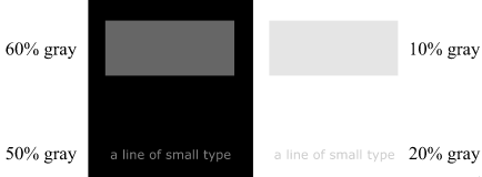
| Fig. 3: Use more contrasting colors to help small things stand out |
|
Figure 3 shows a rectangle and a line of small type, colored dark gray on black background on the left, and light gray on white background on the right. Seemingly, within each pair the elements are of the same color, but the catch is that to achieve this effect of equal density, I had to lighten the dark gray text and darken the light gray one (they both differ by 10% of brightness from their respective rectangles). By the way, I already employed this technique for text labels on Figure 1. As for the proportion of your graphic's parts, you should remember one simple rule: effects that are based on contrasting sizes can rarely survive any significant size reduction. The smaller member of a contrasting pair often becomes hardly visible (or worse yet, it's visible somehow but you can't say what it is, which is annoying), and its opponent becomes an "orphan." This is a rule that is especially important for designing logos, because logos are likely to be viewed in various sizes, including the very small. Of all graphic finishes, drop shadows suffer the most discouraging transformation. When reduced beyond a certain level, drop shadows smash into a nasty mud, which can make it much harder to read the text that the shadow is attached to. The same applies to various glows, transparencies, gradients, and other popular bitmap effects---in short, small sizes favor geometric simplicity rather than photorealism. Interestingly, this is in line with the current design fashion that considers drop shadows, quoting an IPPA review, "one of the greatest legacy items in the world of poor design." Not that I could readily submit to this judgement, but the pursuit of "pure" design without resorting to naturalistic tricks is undoubtedly commendable---when it achieves its goal, of course. |

| Fig. 4: Remember the last time when you saw a graphic without anti-aliasing? |
|
When working with text, you may find it necessary to abandon anti-aliasing for very small font sizes to improve their legibility. (Actually, anti-aliasing is a primitive species of the naturalistic drop-shadow-like effects just discussed.) A magnified example of such ultra-small type is shown on Fig. 4, and its natural-size source can be viewed on this microsoft.com page. Note, however, that to achieve good results without anti-aliasing, you need to use fonts specially prepared for low-resolution screen output (such as Macintosh or Windows system fonts). Also, remember that sans serif fonts are more legible in small sizes than fonts with serifs. A few words must be said about graphic formats. For images less than about 100 pixels in both dimensions, GIF becomes the only practical option. Small JPEGs do not offer any advantage in file size even for photos, mostly because tiny GIFs allow using low color depth values (for example, 3 or even 2 bits per pixel) without dithering and without any noticeable quality loss. By the way, along with JPEG, many advantages of using photographic images are gone in the world of small graphics; with a span of a couple dozen pixels, a photo can often be difficult even to recognize as a photo. Both GIF and JPEG are bitmap (raster) graphic formats, but there are also a number of vector formats proposed for the use on the web, although none of them is commonlty accepted as of yet. The predominant use of bitmaps on the Web has both advantages and disadvantages to it; you can't easily scale bitmap images, but in reward you can control every single pixel and thus achieve many effects impossible in vector graphics. When compared with bitmaps, vector images nearly always look pretty raw and unpolished, and such objects as photographs are not representable as vectors at all (vector formats can display photos, but they store them internally as bitmaps). On the other hand, vector formats offer the great advantages of scalability (for most objects) and low bandwidth requirements (often orders of magnitude less than what the same image would require in a bitmap format). Also, recent developments show that much of the vector-specific roughness is not truly essential and could be ironed out. For example, Xara offers its vector format which, in addition to all the above advantages, can implement a number of very "bitmap-looking" effects. Those who have read my recent case project column may be surprised to learn that each piece of graphic on Quiotix site (including all drop shadows, transparency effects, etc.) was done in Corel Xara drawing program with minimum or no bitmap post-processing. |
![]()
![]()
![]()
![]()
![]()
Revised: Nov. 22, 1997
URL: https://www.webreference.com/dlab/9711/absolute.html
 Find a programming school near you