Putting It All Together: a Case Design Project. The Logo
| The Logo |
|
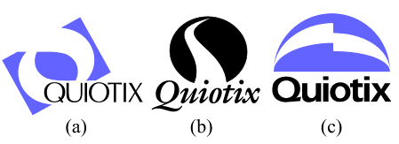
For five years, the company's logo was simply text with its name set in Avant Garde font, colored purple, and usually oriented vertically in the top left or right corner of the page. You can see an example of the logo on their original site---whose simplicity, admittedly, well complements the austerity of the logo. The client hinted that I might use some of the original logo's aspects (font, color, or position) in my design, but eventually I departed far away from this prototype. In fact, even the first three samples I submitted to Brian (see Fig. 1) weren't in any way similar to the original Avant Garde logo. I usually start by presenting a number of quite different logo drafts, eliciting feedback and trying to identify my customer's tastes and preferences. Then, I narrow the "stylistic scope" by creating new variations close to the one chosen at the previous stage, and by repeating this procedure over and over I finally zero in on the most satisfying version. |
| Fig. 1: The first three logo drafts |
|
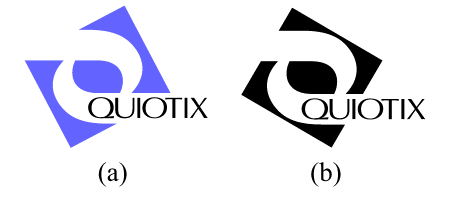
In this particular case, the convergence rate was good from the start; of the first three samples, the first one faced a warm welcome while the other two weren't approved at all. In fact, the visuals in logos (b) and (c) are much more convenient-looking than that of (a); the (a) also has the advantage of its shape remotely resembling "Q", the initial letter in the company's name. Finally, the asymmetry of (a) seemed to be more in tune with the taste of my customer than the more traditional layouts of (b) and (c). Thus, I moved on trying to improve upon Fig. 1 (a). My first attempt was rather radical (Fig 2): I changed the font and transformed the rectangle into a perfect square; also, I adjusted the rotation angle of the square so that the inside "sleeves" (a bit streamlined) run precisely into the square's corners. The idea behind all these changes was to make the logo more compact, more tightly integrated, and less "sketchy." |
| Fig. 2: A proposed improvement of Fig. 1 (a) |
|
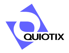
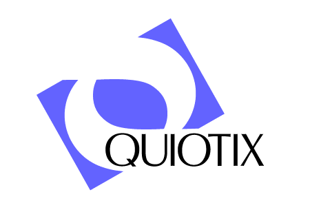
The effect, however, was not positive. Brian felt that the original variant (Fig. 1, a) was better in nearly all respects: the font, shape and slant of the visual. I started to realize that although tight coordination and symmetry are thought to be necessary for a good logo, sometimes asymmetry and a bit of "looseness" may work better. Actually, it may be argued whether one of Fig. 1 (a) and Fig. 2 is really better than the other. Undoubtedly, however, these two versions are quite different in style, so the best thing that a sensible designer can do in this situation is to attend to the customer's preferences. After a couple of compromise attempts shown on Fig. 3 (where I made the visual more rectangular while preserving the new design of the sleeves, returned to the original font, and tried out a different rotation angle), we had arrived at the final image as on Fig. 4. In fact, the only significant difference of Fig. 4 from Fig. 1 (a) is a better coordination of the text with the visual: Note that the first "I" stands exactly against the middle of the top sleeve's mouth, and one of the strokes of the "X" is almost a continuation of the rectangle's top-right side. |
| Fig. 3: Looking for a compromise between Fig. 1 (a) and Fig. 2 |
| Fig. 4: The final logo |
|
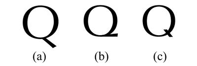
The story of the "Q" lettershapes deserves a paragraph of its own. The original letter of the Optima typeface used in the logo (Fig. 5, a) was not suitable because its descender stretches far to the bottom of the letter, thus making it difficult to fit the title into the "slot" of the visual. My first attempt to compose a "fixed-height" Q (Fig. 5, b) was inspired by the Erika typeface used in the version on Fig. 2; its additional advantage is that the horizontal descender of the letter visually supports the shape of the horizontally oriented sleeve. However, with the light-weight Optima font, such a "Q" is hardly readable in small sizes (which is important, because the company's name is not a recognizable word), so we finally chose the more traditional design of Fig.5 (c). Later, I used the same "Q" shape in all labels and headings on the site which used the Optima font. |
| Fig. 5: The Q Saga |
|
The Optima font was considered optimal (pun intended) for this logo because it's not exactly a sans-serif font (the strokes are a bit expanded at the ends) but not a serif font either. Serifs, whose purpose is to guide the eye along the line, would be an overkill given the strong horizontal "guides" of the sleeve in which the text flows. On the other hand, a classic sans serif font such as Freeset or Erika (used in Fig. 2) might seem rather dull with this visual. The story of this logo project is instructive in two ways. First, you can see here how time-consuming it may be to fiddle with really minute changes: it took only 20% of the total logo design time to create Fig. 1 (a), and 80%, to advance from it to Fig. 4. Second, when you do a job for someone, you should remember that it's your customer, not you, who's going to live with the design you create and to become accustomed to presenting it as something of their own. You may spend your time explaining yourself and even educating your customer if you feel that this may lead them to accept your point of view, but you can't argue. In most cases, you must accept what you're told even if you feel you're making a step backwards. |
![]()
![]()
![]()
![]()
![]()
![]()
![]()
Revised: Oct. 23, 1997
URL: https://www.webreference.com/dlab/9710/logo.html
 Find a programming school near you