Putting It All Together: a Case Design Project. Front Page I: The Quest
| Front Page I: The Quest |
|
As with the logo, I first used my drawing program to create GIF images for design drafts of entire web pages and sent them to Brian for discussion. Naturally, my first shot was at the front page design, and only after its concept was more or less worked out I moved to drafting a generic subpage. As you can see from the original site that I preserved for comparison, the site's front page isn't packed with information which is convenient for our illustration purposes. Although the color scheme of the logo (see Fig. 4), with black for the text and bright blue for the visual, remained unchanged for most part of the logo design stage, it shouldn't be considered fixed. As I mentioned elsewhere, a good logo must not depend upon the use of colors. This particular pair of colors (black and blue) looks quite good when the logo is shown by itself, over a white background; but the same colors may turn inappropriate when the logo is placed on another background and surrounded by other elements with their own colors. That's why, when I started working on the front page design, I didn't take the color scheme of the logo as a base. Instead, I tried to tame quite another area of the color wheel, the one that I once called "swampy, muddy, saprogenic"---the desaturated blends of yellow and green, the color usually called "khaki." Actually I already have one relatively successful attempt to colonize this color realm, but now I wanted to see if I can manage a more pronounced khaki tint without the page becoming too military-looking. I chose the soft greenish background color (Fig. 6) and supported it by the more saturated (but similar in hue) color of the logo visual and the links. In an attempt to make the logo more prominent on the page, I used the "spotlight" effect placing it over a circular white spot with blurred edges. Also, I made the logo's shape feel more like a "real thing" by adding a drop shadow and placing an elliptic gradient over the shape, which thus looked as a metallic (golden?) surface reflecting the light of a lamp. |
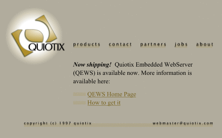
| Fig. 6: The first step in the quagmire |
|
For the navigation bar, I used the Lucida Sans font in small size, with the "out-of-focus" doubling effect and barely visible background rectangles. At this early stage when the main design idea of the site was only groped for, I tried a solution dictated by the current design fashion---indeed, the Lucida Sans font (as well as its analogs, e.g. Officina Sans) in very small font sizes and with various artificial distortion techniques is now a highly popular design theme. However, in my case this theme wasn't supported by anything on the page, so the "khaki" version was a moderate success. To a fresh eye, the page looks simply unbalanced; the bright spot of the logo is too large an element, while the elusive, whimsical buttons are just difficult to discern. The top left corner contrasts too much with the rest of the page. Thus, my next attempt was mostly driven by the desire to balance the logo (I decided to keep the spotlight effect that Brian liked) by other page elements, mainly by the navigation bar graphics. I also completely changed the color scheme, dashing somehow towards the other extreme: cold blue and white over gray (Fig. 7). |

| Fig. 7: A winter landscape with the moon and northern lights |
|
First came the idea to stretch the kernel of the logo's spotlight to the right with a wide white horizontal strip serving as a background for the navigation bar. This way, I avoided placing the "QUIOTIX" title in the logo over a white-to-gray gradient which could damage its readability. But the main advantage of the strip was that it united the left and the right wings of the page top into a solid whole. The spotlight isn't floating any more like a moon in the amorphous sky, but sets a coordinate origin for the entire page. However, the strip couldn't be left just plain, boring white. Logically, it is the ideal background for placing the main graphic theme of the site---now it was clear that just the logo wasn't enough, something else was necessary to make the design persuasive. My first try was the company's title enlarged, blurred out, and repeated twice with a shift. Over this suggestive background I placed "buttons" made of the Lucida Sans labels and uniform gray semi-transparent rectangles. At the page bottom, a narrower horizontal bar of similar design held the copyright and address footer. This version was definitely better than the previous one, but not good enough. The style of the buttons was still alien to the logo/spotlight composition, and to Brian's taste, the vague "QUIOTIX" lettering in the role of background was a bit "over the top." Finally, the color scheme was simply too dry and monochromatic. I liked the gray background, but the magenta of the logo and links wasn't enough to spice it up. |
![]()
![]()
![]()
![]()
![]()
![]()
![]()
Revised: Oct. 23, 1997
URL: https://www.webreference.com/dlab/9710/front-i.html
 Find a programming school near you