KISS: Keep It Simple ... : Production Graphics with Wendy Peck at webreference.com
 |
KISS: Keep It Simple ...Why? |
|
|
|
I'm sure most of you can fill in the final word for the KISS acronym ("Keep It Simple Stupid" for those not indoctrinated with North American icons). This most wise principle can be applied to nearly every facet of life and business, and seems to be adopted in direct proportion to experience level. The more we know about any subject, the more we seem to be able to find the elegant and simple solutions. My Web design career certainly followed a path to KISS enlightenment. As I learned about HTML, JavaScript, CSS, optimization, etc., my designs were hopelessly complicated. Technically impressive, I'll admit as I look back, but more valued for what I learned than for the usability of the sites I created. Fast forward five years, and my designs have become almost painfully simple. I still think they look good, and others must agree, or I would not be hired, but technically, they are not challenging. Let me rephrase that. Technically, they are not cutting edge, but in a lot of ways, they are more challenging. The challenge comes not from creating a new script, or a flashy JavaScript action to work, but from using tried and proven methods to create a useable page that meets client needs, loads quickly and is intuitive for the visitor. |
|
|
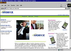
The entry page for Mobyz.com.
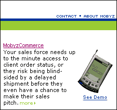
Teaser menus are text, and scattered through the site. Flash demos are linked, not automatic.
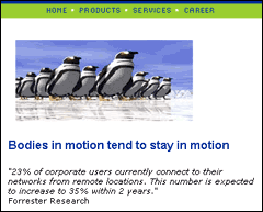
The main menu uses graphics to make display consistent for all browsers. This same look could be done with CSS and text. |
The samples at the left, are from the Mobyz Mobile Business Web site I did last year. We worked hard to create a very simple site. Although the company is based in the high tech world, they understand that communication is much more important than bells and whistles. We created a site for impatient visitors. It is also very easy to update and maintain, thanks to the CSS driven text menus for all but the main menu, and the decorative menu on the entry page. Listings can be changed with typing, not graphics. For this client, that was very important, as the site is maintained by the back end programmers. My role was for design and navigation only, and graphic menus would have hampered their ability to change menu items on the fly. (The list of arrays and actions, work arounds and troubleshooting that programmers hold in their minds boggles me, but Photoshop strikes terror into their hearts.) There are Flash demos on the site, and even a small animated GIF on the entry page. We did not toss aside all popular technology, but made sure that it earned its keep before it was used. We also held on to the "old" at times. We used graphic rollovers for the main menu and the entry page because the CSS rollovers do not work in some Netscape versions, and we wanted those areas to be consistent for all users. I do not believe that a site like this is the only "correct" answer, but presented the example to show the process that is required to create a great site. If you read back through the previous paragraphs, you will notice a theme: "We did this because ..." That is the critical concept for any site. "I am adding this script because it will do this for the visitor experience." "I am not going to use this technique because ..." I'm sure you get the idea. The purpose of this article is two fold. The first goal I have is to convince some of you to simplify everything that you are doing. There are several reasons for this, the most enticing that your income will likely go up. The designers I know who have remained consistently busy through the dot com crash and then the general slowdown in the economy have all adopted a very practical attitude to Web design. The majority of paying clients, both large and small companies, require a highly useable site that looks good, but that does not confuse or frustrate visitors. |
|
|
|
Please don't get me wrong. We need those who strain at the leading edge of technological development. They are the ones who make the browser developers keep up. They fuel new software development so that the rest of us can do our work more quickly. They inspire us to always improve. But for most of us, myself included, if we are to make a living with Web design, we need fast methods to create the best sites for our clients. That reality is part of every industry, yet too often, we creative types believe that we are "selling out" or are "frauds" if we do not constantly push ahead where no designer has gone before. I do not believe that is true. In fact, I think many clients are hurt by this attitude. I have suggested many times in this column that designers have a personal site where they add whatever catches their attention. Satisfy your desire to stretch and grow into new areas on your personal site, and bring to your professional work only that which can help your client achieve their goals. The second purpose for this article is to give you some practical simplification tools. One of the most important tools for a simple site is text, both HTML and graphic text, and I urge you to read through Type Right for a Pro Look as part of this exercise. We will look more at text here, but the basics of typography as it applies to the Web are covered in that article. |
|
|
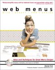
A series from this column, Menus with Beauty and Brains, spawned my book, Web Menus with Beauty and Brains, published by Hungry Minds. |
Also, the series Menus with Beauty and Brains: 1, 2 and 3 will help with menu ideas and techniques for the KISS site. This series talks about menu organization, working with small text and many other topics that form the less tangible problems in designing a site. I expanded this series of articles into a book, Web Menus for Beauty and Brains, published by Hungry Minds and available at major bookstores and Amazon.com. Watch for an excerpt from the book right here very soon. |
|
|
I know that I am promoting the exact opposite message that you will hear on many Web development sites. Many will take exception to my KISS theories, no doubt assigning me to the heap of "fraudulent artists" who have sold out. I disagree. It is not easy to create something very simple, and I believe it takes more artistic talent to create a beautiful page when the designer must work within usability restrictions. There is always one thing I keep telling myself as I ponder this age-old art question. My attitude towards producing useable work is the primary reason I have made a good living as an artist for close to fifteen years without a "day job." And isn't that what it is all about? |
||
|
|
KISS: Keep It Simple ... : Tutorial IndexWhy? |
Created by Wendy Peck,
URL: https://www.webreference.com/graphics/column53/
Created: February 6, 2002
Revised: February 6, 2002





 Find a programming school near you