KISS: Keep It Simple ... pg 2: Production Graphics with Wendy Peck at webreference.com
 |
KISS: Keep It Simple ... Following the Trends | |
|
Eddie Bauer is a full e-commence site. The entry page is shown here, with many text links.
Land's End was an early entry into the retail move to Web sales. This shot shows the lower part of an interior page, sporting many text links and teaser menu items (see Menus with Beauty and Brains). |
Have you noticed how trends seem to come and go on the Web as in any other aspect of life that demands design? There are trends in home decorating, architecture and print design, so it should be no surprise that as the Web matures, trends are inevitable. The current trend appears to be towards simplicity in commercial sites. There is a huge trend towards full Flash sites in the artistic world, but true commercial sites seem to be going more and more to simplicity. The information on each page is clearly available. Visitors can get anywhere on the site from any page with just a few clicks. Background color is as important as graphics to divide the page and create menus. Text links abound. Even a few of my favorite, great Internet successes like Eddie Bauer and Amazon.com have simplified to the basics. These sites move products, and are worthy of careful study.
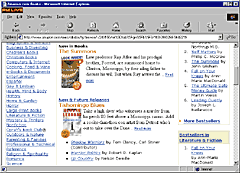
Amazon.com pages are filled with simple text links to help shoppers get where they want to go, or to prompt a visit to a featured area. This is a shot of a lower portion on an interior page. Most of us are not designing for retail giants like the companies I have featured here. But that does not mean that the principles that are used on very large sites do not apply to smaller businesses. In fact, the retail giants will attract and keep some visitors simply because of name recognition. When you have a small business, your visitors will not have that reason to stick around. Nobody will doubt the credibility of a business like Sears, but a professional front is extremely important for a business with little name recognition. |
|
|
The Worldcom US page, featuring excellent design and use of space with an impressive number of links for visitor convenience. |
But What About Beauty? As long as designers are working on the Web, you will find pretty pages that are easy to use. The sample at the left, Worldcom, nicely combines artistic elements, a little drama, and easy to use text links. This page includes 29 text links, 4 graphic links and a search function. I vote for this page as amazing use of space (no scroll at 800 pixel-wide display) while maintaining a highly professional and appropriate look for the page. There are many samples like this, and I hope over the next few years that truly useful, and attractive pages will become the norm. I would not say we are there yet, but I believe the day is coming. Help Me Gather Great Examples Moving to the Practical Application |
|
|
|
KISS: Keep It Simple ... : Tutorial IndexWhy?
|


Created by Wendy Peck,
URL: https://www.webreference.com/graphics/column53/
Created: February 6, 2002
Revised: February 6, 2002
 Find a programming school near you