KISS: Keep It Simple ... pg 5: Production Graphics with Wendy Peck at webreference.com
 |
KISS: Keep It Simple ... Tricks for Text Menus | |||||
|
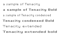
Tenacity is a pixel font, meant to be used with antialiasing turned off, and at a specific font size. |
It took me longer than I care to admit to discover the magic of text menus. I cringe when I think of a few large, menu-heavy sites I created with graphics throughout. Although my optimization focus is high, and my graphics very "light," the amount of work I did to create hundreds of graphics featuring simple text, is enough to teach me a permanent lesson. Once you have worked with text menus, you will find yourself looking for any excuse to repeat the experience. You may wonder why I am so prepared to give up the font selection that is only available to Web designers with graphic text. The truth is, very few fonts look good in menus, especially at small sizes. In fact, the one thing that will send me to a graphic menu is small text. Fonts like Tenacity (shown at left) are extremely clear, and produce tiny type menus that cannot be duplicated with HTML text. (See Menus with Beauty and Brains 2 and 3 for a discussion about small text in menus.) |
|||||
|
The interior menus are all text, with mouseover effects controlled by CSS. |
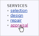
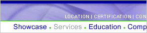
I still do graphic menus. Often the main menu on the page features graphics, and the sub-menus on interior pages are created with CSS controlled text. If you refer back to the introductory page for this article, you will see that is exactly how the Mobyz site was created. My most recent site, so recent that it has not yet been launched follows the same pattern. The main menu, (section shown below), is graphic. The larger menu uses graphics for the softer appearance of the text (HTML text does not provide anti-aliasing). The small menu is created with Tenacity for clarity. The white on light was not legible without the crisp, clean lines of Tenacity. The interior menu is shown at the left, with both the original and mouseover colors showing. This is a combination of graphic and text menus that has worked well for my clients.
Main menu is graphic to have antialiasing on the larger font, and use the pixel font, Tenacity, for the small type. |
|||||
|
#menu A { #menu A:visited { #menu A:hover { #menu A:active { CSS definitions for the first menu shown at the right. CSS definitions for the class style are shown below. This style controls the lower menu at the right. .menu {
.menu A:visited { .menu A:hover { .menu A:active { |
Creating CSS Styles for Menus Note: Netscape version 4 browsers will not see any rollover effects with the following method for creating menus. However, the menu will appear in the original state as you specify, and the links will work. The hand symbol does appear over an active link in Netscape, so the method, while not perfect, does degrade reasonably well.
Straight, font-control CSS demands that all links are the same color on every page. While there is no reason that a text menu requires special CSS settings, often your menu is on a background color that will not work for links designed for white pages. I have always recommended that you keep links as blue, no matter what the page design may be to take advantage of a strong, visual clue for your visitors. However, I do not hold to that for text menus. The formatting alone should make it stand out as a menu, so any color will still communicate that links are available. For blue page links and brown menu links, you can create an ID or class selector, and then define the attributes you desire. An ID selector has a # character, followed by a name you choose. In the menu below, I have used "menu" as the ID name (#menu in the code). Definition for the ID is added by referring to the ID name and the attribute you wish to change. To create a mouseover effect, you use #menu A:hover {}, with the desired attributes listed between { and }. See the first CSS code example at the left. The menu below has been enclosed in a <div id="menu"> tag. The CSS controlling the style is shown at the left. For easy comparison, I have included a standard page link to test. Note: The links for this sample are dummy links only. If you wish to use the selector on more than one menu on a page, you should define a class style. A class selector is created with a . (period) followed by the name you choose, .menu in the menu sample shown below. Define the attributes for the style by stating the name with the attribute you wish to change. To create a mouseover effect, use .menu A:hover {}, with the attributes listed between the { and }. See the second sample code at the left for the code from the menu shown below. The menu below has been enclosed in a <p class="menu"> tag. Not much to it, right? But the power that you have in your hands when you control the attributes of links makes text menus a serious competitor for graphics menus as a way to make attractive, coordinating menus in any situation. Note: There is no need to create a special definition for menus if you want the links in your menu to be identical to your main page links. |
|||||
|
Menu layout created with a table. The sample above is how it appears on the page. The sample below has table borders turned on to show the table structure.
|
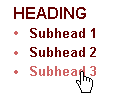
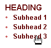
Making Text Menus Look Like Menus This little dot, , created with HTML, • (or Alt 0149 on the number pad for PC users), is a gem. It can help define subhead menu items clearly from headings as shown at the left. I have a three column table setup for this menu (see the lower sample showing table borders). I have used three columns to provide spacing. Using cell padding or spacing creates vertical spacing between menu items that is too large to form a cohesive appearance. Note another trick that can really dress up a menu heading -- the all caps presentation. I suspect this will be the first time in my career I have recommended all caps, but in this case, it forms an excellent heading style. Take a peek at the menu above in this column. The menu items are divided with the | character (Shift+ /), one of my favorite tricks for horizontal menus. It is very quick, and provides a crisp clean divider that makes your text look like a menu. I like this divider so much that I often use it as a divider for menu items when I am creating graphic menus. You can also use the character between horizontal menu items. Try changing the color of the dot to tie in an accent color. This is just the bare beginnings of what you can do with CSS controls on text menus. Don't forget that you can use background color for links or mouseover states, and have many choices for borders, text styles, etc. Always remember, however, that Netscape 4.x users will not see any mouseover effects. Plan accordingly so the menu degrades well. Give it a try with your next project. My gambling guess (and I do not gamble recklessly) is that you will never look back. |
|||||
|
|
||||||
|
|
KISS: Keep It Simple ... : Tutorial IndexWhy?
|
Created by Wendy Peck,
URL: https://www.webreference.com/graphics/column53/
Created: February 6, 2002
Revised: February 6, 2002
 Find a programming school near you