Menus with Beauty and Brains 2 pg 4: Production Graphics with Wendy Peck at webreference.com
 |
Menus with Beauty and Brains 2: Building Tab Menus | |
|
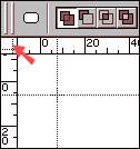
Moving the zero point in Photoshop. Click and drag at the point marked by the arrow. The dotted line shown is placed where you wish the new zero coordinates to appear. |
We will only look at creating the actual tab images in this section. General menu creation notes Learn to use your rulers. We usually know how many pixels we have for a total menu area. If we work to measurement from the start, we will have fewer surprises as we scale our work to final size. Many designers do not know that most graphics programs have an adjustable zero point, which means you can change the location for the zero point on the ruler. Simply click on the area between the horizontal and vertical rulers and drag the crosshair to the desired new zero location. (Paint Shop Pro does not offer this feature.) Also, take a look at the grid feature in most graphic programs. Rulers, guides and grids can all help to make the menu creation process more efficient. Although the methods that follow are specifically for tabs, the setup and many of the techniques work for plain color bars, or bars with different colors for each menu listing. I have included instructions for: Photoshop 6 (with variations for Photoshop 5.5), Paint Shop Pro, and Fireworks. |
|
|
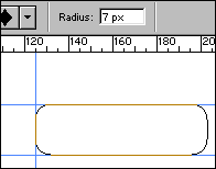
Work path created with Rounded Rectangle tool.
Path converted to a selection. Adding rectangular selection to bottom section. Note the + symbol indication an addition to a selection.
Finished selection above (magnified view). Filled with layer style and text added below.
|
Photoshop tabs To start, set up your grid or guides, at least for the height of your tabs. Select the Rounded Rectangle Tool and set the corner diameter. For the sample here, I used 7 px. To complete the first tab, we will convert the vector path to a selection. Open the Paths palette (usually with your Layers Palette). You should have a path called Work Path in this palette. Right click on the Work Path path, or select the path and click the flyout menu icon at the top right of the palette. Select Make Selection from the menu, with Antialiasing checked and Feather set to 0. Your path will become a selection. We want to add a square bottom so that our tabs can butt together tightly. Holding your Shift key down, add a rectangular selection to the lower half of the rounded rectangle as shown to the left. This is your finished tab selection. Save the selection. (See Photoshop Selections.) Create a new layer. Fill the tab selection with your background color. This is your basic tab. You can add a stroke or a layer style to complete the effect you desire. Once you have completed one tab, you will use it to create the remaining tabs. There are several ways to duplicate tabs in Photoshop. If you are making tabs of the same color, simply duplicate the layer containing the tab, moving the new layer into position beside the original. You can also load the saved selection to create a new tab on a new layer. Fill and copy any effects from the original tab layer. If you want tabs of different colors, loading the selection and filling with a new color is the best method. The tabs at the left were created using the saved selection. |
|
|
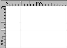
Guides in place for tabs. Note raised area in the ruler that corresponds to each guide.
|
Tabs in Paint Shop Pro Activate the Selection tool and choose Rounded Rectangle from the Tool Options palette. Create a selection the height and width desired for the first tab. Turn off the Snap to Guides option. Change to the Rectangle option in the Tool Options palette and with your Shift key held down, add a rectangular selection to the lower portion of the rounded rectangle as shown in the sample at the left. This will give you a square bottom for the tab, allowing each tab to butt against the next. Save your Selection. (See Paint Shop Pro Selections.) Fill and add effects to your tab as desired. To create a second guide
of the same color, simply duplicate the tab layer and reposition. If
you require tabs of different colors, load the saved selection and apply
the fill and effects for each new tab as you did for the
|
|
|
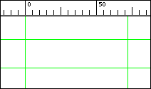
Guide setting for one tab with the zero point moved to the left edge of the tab position.
Rectangle drawn with a different color in front of the rounded rectangle.
The rounded rectangle and rectangle have been combined to form one object.
The final tabs. |
Fireworks tabs Start by setting up guides. Turn on your rulers, and click and drag on the horizontal ruler to set a horizontal guide. Release the mouse button at the desired location. Create a vertical guide in the same way, but click and drag from the vertical ruler. You can move the zero point to help while setting your guides. In the sample at the left, the zero point has been moved to the left edge of the first tab position. Select the Rounded Rectangle Tool and, with the main tab color, draw a rounded rectangle between the guides. Change your fill color to make the next few steps easier to complete. The color does not matter. Change to the Rectangle tool and draw a rectangle over the lower portion of the tab, creating square corners at the bottom edge (see left). We will now combine the two objects to make them one and complete our tab shape. Select both objects. Select Modify>Combine>Union. This joins the objects into one, with the color taken from the object at the back. And that's that. You have a basic tab shape. Apply stroke, texture or any effect as desired. To duplicate the tab, simply click and drag, pressing your Alt key before you release the mouse to place a duplicate. If all the tabs are the same, complete the first tab before duplicating. If the tabs have different colors or textures, duplicate the shape and change attributes as required for the subsequent tabs. The finished tab with an inner bevel effect added is shown at the left. Tabs are not only clear indicators for visitors, but are also easy to create no matter which Web graphics software you are using. Give them a try and see what variations you can come up with to add a fresh look. Finally, we will finish the first look at graphics menus by introducing liquid design. |
|
Menus with Beauty and Brains 2: Tutorial IndexMenu Graphics that Work |
URL: https://www.webreference.com/graphics/column43/
Created: February 18, 2001
Revised: February 18, 2001


 Find a programming school near you