Menus with Beauty and Brains 2 pg 3: Production Graphics with Wendy Peck at webreference.com
 |
Menus with Beauty and Brains 2: Creating a Menu Framework | |
|
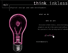
ThinkInkless.com menu showing colored light bulb which is triggered by the mouseover shown below. |
You have your site plan ready, and have identified a few fonts that will produce great results for your menus, so now comes the fun. You have to decide what form your menus will take. There are as many ways to frame a menu as there are designers in the world. I have seen some very creative menu frameworks, especially on artistic sites. If your visitor base calls for it, let your imagination run. I am not a big fan of playing "find the menu" for sites where you see no navigation until you mouse over the correct spot, but even that variation is appropriate for a narrow visitor base - a very narrow visitor base. ThinkInkless.com, a Web development business site, is a perfect example of an alternative menu presentation that works. On each menu mouseover, an animated rollover appears, and the light bulb changes color to match the featured rollover color. In the mouseover sample I have included as full size, the pink "O" characters hop up and down. Note that the designer has included Alt tags. Consider that even on my very slow (24k) connection, this site loaded fast, is fun and innovative, yet is quite logical and includes accessibility features excellent proof that form need not replace function. I recommend a trip to this site, since the menu reflects the tone of the entire site. The theme is left brain/right brain, each represented by one of the partners in the business. Every element of the site enforces the theme, for an extremely cohesive site. |
|
|
Colored tabs mark your position in the site at Apple.com. |
Tabs: Classic, or tired trend? Do not discount the idea of tabs, just because so many sites feature this navigation. At times, trends become classics because they work. In my opinion, tabs fall into that definition, and I think we will be seeing them for a long time yet. See the next page for specific instructions to create tabs for several programs. |
|
|
|
Menu bars However, it gets a little more complicated if you wish to create a liquid design, or have your bar stretch across the page for any resolution. It gets even more complicated if you want the liquid design, but want your bar to have a pattern, or have shading. Diamonds.com, the site I used to describe the menu creation process in the last article, (see Menus with Beauty and Brains) uses a colored and shaded bar (shown at left). I will go into how to create a liquid menu bar using a background image later in this article. |
|
|
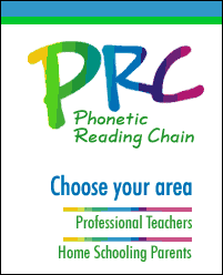
Top menu from the PRC site. Simple categories make it easy for visitors to move from section to section. Side menus, shown below, direct the user groups from inside the main section.
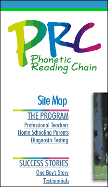
On the entry page for the site, where a specific side menu was not required, we included a site map (below).
|
Side menus You may be thinking that I have finally gone over the edge with that last statement, or that you misunderstood what I was saying. But I assure you that I meant it. Long lines of text are very difficult to read. If your content is displaying with lines containing 20 words or more, you are making your visitor work far too hard. Eyes cannot follow along for that distance without straying. Even well-behaved eyes that can make it to the end of the line, will have a break in the reading flow as they try to find the start of the next line. Plus, there is an ugly factor for short paragraphs which perfect Web writing entails. Picture three short, snappy paragraphs, where two of them display as a single line. I've seen it, and I never surf using more than 1024 wide display. Enter side menus. Even if you do not have enough pages to warrant a side menu, you can use the left area for teaser menus, or to create a bulleted list of features. I used this solution on my site, which is a total of five pages (wpeck.com). Unless you have a lot of content, consider adding a right menu area, as well. Last time I talked about designing for 800 px width, but placing "disposable" content at the right edge of the screen. Both left and right menus can help keep your content line length within easy-to-read bound. I have included another of my client sites at the left. The PRC site has a simple structure, categorized by the top menu. Although there are not many "sections," we faced the problem of three different client groups for the product. We handled that division with side menus within the larger sections. Since the front page did not need a side menu, we were also able to address our concern that visitors would not know where to go on arrival. The side menu area was used to present a site map. Of course, this only works for a small site, but it was a very good solution for this site. Side menus can take on many forms. The Burpee.com site makes very good use of side menus. We talked last time about the Diamonds.com side menus. They are great candidates for HTML text or dynamically created content. You can use buttons, or bars, or grid patterns. Some sites use side menu areas to add a graphic, or background image to liven up the page without taking away the space for content. Keep your eye out for side menu ideas as you surf the Web. You will find many great ideas. For the graphics portion of this article, we are going to concentrate on horizontal menus, though, since they wander into the topic of liquidity, which adds a wonderful challenge to menu items. We will focus on side menus in the next article when we look at popout style menus. These menus are often placed in a side menu position. Let's move on to make some tabs, and get our graphics spanning a page from border to border. |
|
|
|
Menus with Beauty and Brains 2: Tutorial IndexMenu Graphics that Work |
URL: https://www.webreference.com/graphics/column43/
Created: February 18, 2001
Revised: February 18, 2001


 Find a programming school near you