Menus with Beauty and Brains pg 4: Production Graphics with Wendy Peck at webreference.com
 |
Menus with Beauty and Brains: Creating Consistency | ||||
|
Although I do not use the automated HTML or JavaScript generation features of my graphic programs like ImageReady and Fireworks, I always use the slicing and optimizing features. If your favorite program offers slicing, I strongly recommend that you learn it and use it!
|
All the skill that graphic artists work so hard to develop has not come into play much yet in this article. But once we have our plan laid out, that graphic skill takes the stage. For over a year now I have been bringing the word consistency to these pages. Many times I will cite an automated method for both saving time and providing consistency to your work. Menus are one of the main reasons I tend to repeat this statement over and over. Let's start with a small menu dilemma we faced with Diamonds.com. Remember our bouncing help menu item from the early planning? Scott wanted it on every page, and did not want it in a menu. My natural instinct is to place it a repeating element in the same location on every page that just makes sense for user convenience. However, with several page styles in this site, there was simply no one place on every page that the help icon could be placed. Originally, we had a demure icon to represent the help link. We solved the problem by making the icon stand out boldly and added subtle animation. |
||||
|
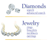
Entry page category menu above. This menu is designed to inform new visitors what the site contains, and make it easy for return visitors to go directly to a sub-category.
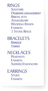
The categories are shown on every in a small menu under the menu bar. See above. The menu item is removed for an active page as shown below for the Jewelry page. Note that there is no Jewelry item in the menu.
|
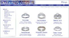
There are three menu areas on every page of Diamonds.com. The main categories menu is bold and steals the show for the entry page. That is important, since visitors should have instant confirmation that they will find what they are seeking. This menu is a simple graphic text menu, with slight rollover effects, and attracts attention simply through its relative size and importance on the page. The entry page is the only place on the site that this menu appears. Remember the main purpose to let people know what they can find at a glance. Of course, the sub-categories help a returning visitor to go directly to the desired section. But once the visitor leaves the main page, that need is not great. But we did want visitors to be able to go through the site without returning to a central location. The main category menu is available on every page in a much smaller form. The sample at the left shows the small version tucked up under the menu bar that goes across the page. This occurs on every page, with the menu link removed when that page is active. See the adjusted menu to the left. This same method is used to mark the active page for a menu bar item. The Policies page menu area is shown below (see larger sample). The Policies menu item has been removed. It is confusing for visitors to have a link to the active page, unless there is some cue that the menu item is active. Because we had so many menu items and wanted to maintain the balance for the upper menu area, we simply removed the active page menu item in all cases. This kept a consistent look for the header of the page, while providing confusion-free navigation. The feedback on the navigation for Diamonds.com has been very good. The page titles also helps visitors to know where they are at all times. This is a a feature that should be included on all sites. |
||||
|
|
Interior menus Light shading came to the rescue to deliver both goals (see Into the Shadows). The soft, fading shadow divided the page effectively, but did not scream for attention. The font and font color are enough to tie the menu in with the rest of the page. This menu appears on all product pages and has proven to be an effective way to keep the product pages separate from the business end of the site, without feeling at all disconnected. In fact, we used the same menu look in the education section of the site.
|
||||
|
Scott and I spent a great deal of time perfecting the navigation system on Diamonds.com. Not all sites require that level of planning, nor can the time we spent be justified, but the basics that were used for this site can be applied to any site. It is always important to be consistent with your look, and to let visitors know at a glance where they are in your site. I try to come as close to page to page navigation from anywhere in the site as I can. |
|||||
Menus with Beauty and Brains Tutorial IndexMenus with Beauty and Brains: the Heart of an
Excellent Site |
URL: https://www.webreference.com/graphics/column42/
Created: February 04, 2001
Revised: February 04, 2001


 Find a programming school near you