Menus with Beauty and Brains pg 2: Production Graphics with Wendy Peck at webreference.com
 |
Menus with Beauty and Brains: Navigation Anatomy 101 | |
|
Burpee.com full page. |
Rather than go on for pages and pages about why menus work or not, I am going to sprinkle the theory through the entire series. You won't find academic discussions about human behavior or spatial perception; these subjects have great merit, and any designer will be better for constantly learning more about how the eyes and brain work together. However, true to my style, we are talking about common sense theory. Take one visitor with mouse in hand. What are they looking for? Where do they want to go? What layout will deliver the "sweet-spot" of the menu world, when the hand holding the mouse naturally moves to the right link at the right time? | |
|
The two housekeeping menus shown above appear near top of every page on the Burpee Seeds site.
The main menu, or category menu, is large and clear, marking where the visitor is in the site with images above the menu.
Once you have clicked into a category, you are presented with a sub-category menu as shown above. This menu appears right below the category menu to keep the visitor on track. If every category was listed in the main category menu, the listings would be tiny and crowded. The designer has created an effective way to keep visitors focused.
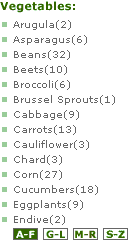
A menu similar to this one appears on every page in the site, and is geared to the current category page a terrific way to give easy access to your most popular products. It could be loosely classed as a teaser menu. The products are "common knowledge" items for avid gardeners, and the name is enough to provide the enticement to click.
Reaching the final category page brings you to appropriate teaser menus in the main content area, and a final sub-category menu. This one is generated dynamically by the content. Although we have seen a lot of levels, when you have thousands of products, it is required. I like the way the Burpee Seeds site takes visitors directly to the product, providing new, and relative information at every step.
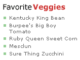
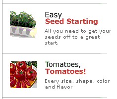
Teaser menus are distributed through the site, and are very well done. This one appears at the right side of the screen and uses a valuable and increasingly popular trick. Many designers are now designing for 800 pixel wide display (and above) but placing all critical content at the left of the screen. The function of this site is not affected if a visitor views the pages at 640 pixels wide, and does not scroll. All images from the Burpee Seeds Web site are ©Burpee Seeds.
|
Let's start by defining a few terms for the purpose of this discussion. These are terms I defined in order to discuss navigation with clients. As far as I know, there is no standard for defining menu terms yet (heck, we aren't even close to standardized browsers). Housekeeping menus: This term refers to the business end of a site, like contact pages, company information, shopping cart, wish lists, FAQ and other help pages. These will almost always appear on every page and should be an integral part of the site design. For many sites, they can be kept quite low key, but available when the visitor looks for them. On some sites, like the Diamonds.com site we will look at later, housekeeping items are a critical element of the site and contain many menu items. Commerce sites featuring high-ticket products must provide exceptional company information to build the visitor confidence level. Housekeeping menus should be highly visible for this type of site. Category menus: This is the main division for most sites. Perhaps the site is divided by product type, like babies, toddlers, and teens or by interest group like teachers, students, parents for an educational site. This type of menu directs visitors into their focus area as quickly as possible, but should not contain too many choices. I try to work with a maximum of six or seven, but prefer not to exceed four or five. It is easier to design an attractive layout when you have fewer category menu items, and I believe that it is easier for the visitor as well. If the category menu is placed vertically, I also want the full menu "above the fold," or completely on the initial screen. Sub-category menus: If you cannot take your visitor to the end goal in two clicks, the second level should provide its own menu. This is most effective if you have absolute consistency with the sub-category look and placement throughout the site. I usually treat the second level page as an entry page on its own. Here you can highlight products using Teaser menus (see below) or provide specific sub-category information in addition to providing the sub-category menu. Content or Interior menus: Once you have directed your visitor into a category, and perhaps sub-category, there are often many further divisions that make sense. These menus can be fully integrated into the graphics for the section, or presented simply as a text menu at the top of the section page. Ideally, this menu should be the "end-of-the line" for most sites the next click should bring visitors to detailed information. Organization is wonderful, and it takes less time to click a link than to scroll through a long page for the desired information. For information rich sites, or large product lines, you may need another level. However, let the warning bells ring loudly whenever you require your visitor to click more than three times before they hit the information they require. Not only do you risk losing them because the route is too long, but you also risk making it hard for them to identify where they are in the site, and confusing when they wish to visit another section. Teaser menus: A teaser is a tiny bit of copy that is designed to entice the visitor to learn more. Often, this is used to list articles, giving the visitor a glimpse of the topic with a descriptive title or a lead-in sentence. A teaser menu also can be used to describe where each link leads and are a often located in the content area of the entry page, or on an interior page when an extra level of navigation is required. Text menu: Most designers will include a text menu that lists the category menu items as well as housekeeping items (see below). This menu is usually placed at the bottom of the page, and is small and unobtrusive. Text menus help people who cannot see the graphics on a site, because of a disability or browsing with images turned off. They are convenient for all visitors, because they will see this menu at the end of a page, where they are most likely to require a link.
Marker menu: This term refers to an icon or text that lists the page numbers that are available. Most search and return type sites will use this system as both a page marker, and to allow quick navigation between return pages. I am not sure how many designers would class these markers as official menu items, but since they help your visitors move through the site, I choose to consider markers as menus. See the examples below.
This small menu provides a map for the visitor and provides links to click to a different level if required. Sites featuring large product lines should provide this convenience for their visitors.
Another marker menu that tells visitors what page of their search results they are viewing. With high numbers of page returns, I prefer to see a reference for each page, with a clickable link (dynamically generated). In this case though, the categories and sub-categories take the visitor to a search that rarely returns more than a few pages, so the clickable previous and next arrows are very effective. I want to repeat that these are my terms. They are not necessarily even logical for you, but it is important to create a set of menu divisions in your mind and name them. Not only will you have much more intelligent conversations with your clients, but the various menu types will begin to take on a personality of their own in your mind. Effective navigation is the most important part of any site and it can be like completing a giant puzzle. Working with clearly defined menu types helps to direct your thinking process, and defines menu areas clearly in your mind. I know it has made the initial design phase of a new project much easier for me. Another little trick is to assign "tasks" to menus in much the same way as you would assign jobs to various team members. When you start thinking that "this menu will handle that job," you are well on your way to creating a navigation system that will work for your visitors. Carry on the the next page for a step-by-step tour through creating a navigation system. |
|
Menus with Beauty and Brains Tutorial IndexMenus with Beauty and Brains: the Heart of an
Excellent Site |
URL: https://www.webreference.com/graphics/column42/
Created: February 04, 2001
Revised: February 04, 2001


 Find a programming school near you