Menus with Beauty and Brains pg 3: Production Graphics with Wendy Peck at webreference.com
 |
Menus with Beauty and Brains: Mapping Your Menus | |
|
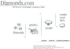
Diamonds.com with its Valentine "window." The main image changes to reflect the seasons and keep the look fresh for return visitors. |
Now that we have some working menu definitions, let's move on to the creation process. I am using Diamonds.com as my example on this one, since I was involved in every step of the site. My role was graphics and navigation. The back end database and e-commence work was completed by a team of programmers and promotion done by another team. This is an ideal working situation, since I was able to concentrate on the look and menu system exclusively. I must also introduce you to my client, Scott Miller, who worked closely with me on this project. Scott is a dream client, in that he has enough graphic savvy to understand the limitations of the technology, as well as respect the skill and experience of a designer. He also has an incredible amount of knowledge about his industry and where Diamonds.com fits, plus understands his customer fully. |
|
|
One of the rejected designs in the early rounds of Diamonds.com development. Our first task was to set a direction for the site look, and we are using only general menu items for this phase. The two samples below are close-up views of the menu areas.
|
Getting Started We started with a series of five proofs featuring different looks, with menu items that were not yet set in stone. One of the rejected designs is shown at the left, with details shown below the thumbnail. Note how the menu items are not the same as appear in the final site. These developed as we went along. One of the reasons we chose the design that exists now is because we needed many more menu items than the sparkling clean look of this design would allow. Scott gave me a list of what information visitors would be seeking and set out several scenarios for how they may proceed to the product pages. Although we did not specifically set out to duplicate a retail experience with diamonds, it became apparent not long into the process that it was a good model. Scott's experience in the industry led the way as the overall structure of the site developed. Although it can be a mistake to compare a Web enterprise to a bricks and mortar one, in this case it did help us to focus on what customers might expect and how they would proceed through the site. |
|
|
The final version of the category menu with sub-category breakdown as was introduced in the note above. The main headings and the subheadings are all links, since there is generic information for that category available on the main category page.
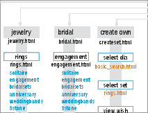
A small sample from the Diamonds.com site map. The horizontal lines that appear at the top of the image lead to the index.html reference. I have included a copy of the full map. The map is not quite accurate as minor changes were made near the end of the project. |
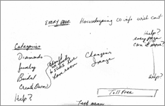
The planning process I have included a copy of an entry page menu draft here. It took several discussions to reach this point, but we are starting to close in on the final appearance. In fact, the note beside the categories section is questioning if we should have the sub-categories listed on the front page, since we had room. I had started preparing the graphic look by this point and we realized that there was enough room to offer that convenience without compromising the look or organization of the menu. Notice how the help button is jumping all over the page. We did not settle that feature in a permanent home until near the end of the project. In the initial stages of site development, I go between draft comps, usually in an illustration program, and hand written notes many times before the direction is set in stone. For this project, we worked on each menu area separately and were quite late in the project before we created a site map. Some designers begin the project with a site map. I find it very hard at the beginning of the project to lay the site out that firmly. Once I have the general look, and have sketched out or created very rough comp images in an illustration program, I can move ahead to a site map. Site Map This map is not quite accurate today, as we made changes near the end of the project, but it was an essential tool to ensure that everyone on the team had the full picture. Many beginning designers think that a site map is a mysterious and highly technical tool. In reality, it is simply laying out the pages that you will have, or already have in your site and tracing where the pages connect. Start with your entry page and make a note for every page that can be reached from that location. Then move to one of the next level pages and note which pages can be reached from that page. Note: Dynamically generated content is always placed into a template page, so only the template appears in the site map. Then take each of the next level pages and make a note of the pages that are linked. When you have every section noted, draw connecting lines between the pages that are linked within the site. If you have external links that are important to your site, they should also be noted. Links that do not add to the structure of the site, such as exchange links can be excluded. That is all there is to a site map. Do not confuse my use of the term site map here with the site map that appears on your site. The site I am describing here is used strictly as a development tool. Creating the menus I haven't counted, but I am sure there are over 1,000 images for this site. Most of those images are attached to menus. If I had prepared them before the direction was set, I would have done twice as much work. I do not usually create rollovers until the final menus are set in stone for this reason. But I need the organization of the site laid down firmly to give me the confidence to move to that stage. Let's move on to looking at how we handled our interior menus and provided graphic consistency through the site. |
|
|
|
Menus with Beauty and Brains Tutorial IndexMenus with Beauty and Brains: the Heart of an
Excellent Site |
URL: https://www.webreference.com/graphics/column42/
Created: February 04, 2001
Revised: February 04, 2001


 Find a programming school near you