Menus with Beauty and Brains 2 pg 2: Production Graphics with Wendy Peck at webreference.com
 |
Menus with Beauty and Brains 2: Making Small Text Work | |
| There are quite a few things to keep in mind when working with tiny text. Not all fonts work at very small sizes. Antialiasing becomes very important and can be a plus and a minus, as you will see a little later. Font color is also critical, since you must have good contrast between your background color and font color when working with small size fonts. Unfortunately, I will not be handing you the answers to every challenge you are likely to face. I have my favorite workarounds to problems, but each project is unique. Let's take a look at some of the problems and a few solutions. | ||
|
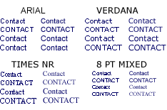
Collection of samples with different fonts at small sizes in Photoshop. The fonts are identified by the labels in the first three samples, and are 10 and 11 pt. The sample labeled 8 PT MIXED shows Arial and Times New Roman at 8 pts. In all cases, the left sample has no antialiasing and the right has antialias set to Crisp.
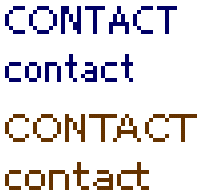
ADSUI3, an Adobe font used for program palettes is shown in blue. The brown sample is Verdana. Note the slight, but important differences in the character spacing (C and T) and the stronger lines in the A and N characters in the top sample. The character widths are more balanced in the Adobe font and present a unified appearance without adjusting kerning. |
The fine line with small fonts However, at 72 dpi, all but the most obvious detail is lost in a character at small sizes. Take a look at the sample at the left, which was produced in Photoshop. The samples are labeled by font and feature 10 pt and 11 pt type. The left set has antialiasing turned off and the right sample is set to Crisp antialiasing. The final sample contains 8 pt Arial and Times New Roman. There are not many acceptable examples in the entire selection. Note how the samples with the antialiasing turned off are rough, and definitely need kerning (adjusting the spaces between characters - see Type Right for a Pro Look). At 8 pts, the text without antialiasing is breaking up too badly to use. However, with the lightest antialiasing available, most of the samples are "fuzzy." What can you do? Experiment with many of the fonts you have now. Usually, fonts that are more "square" work best. It is impossible to give overall recommendations, since colored fonts on varied backgrounds colors produce a different effect for each one. I will not say don't use this or that font (the minute I did, a few of you would use that font in a perfect way - guaranteed). However, I will advise you to experiment and find one or two small fonts that display crisply for the work you do. I have had a fair amount of success using Verdana at small sizes, with no antialiasing, but often did a lot of kerning, which is very inefficient. The font listed as ADMUI3 in Photoshop, which is the font used for the palettes in Adobe programs, is just a little cleaner than Verdana. See the sample at the left for a magnified view of the two fonts. You must use the ADMUI3 font without antialiasing turned on though, and it does not follow the typical sizing. If you own Photoshop, try ADMUI3 for crisp, clean menu items. (This font is intended for the Adobe software system, not production. I cringe thinking of the result if it was used in a print job this tip is WEB ONLY!)
Note: PC users should specify Sevenet 7 font size as 8pts for 72 dpi documents for the Web (it will not work at 7pt). Mac users specify 7pts as the name suggests. |
|
| We've solved (well ... sort of ... almost) the text dilemma, so let's move on to creating the framework for our menus, tabs and liquid design. | ||
Menus with Beauty and Brains 2: Tutorial IndexMenu Graphics that Work |
URL: https://www.webreference.com/graphics/column43/
Created: February 18, 2001
Revised: February 18, 2001


 Find a programming school near you