Nonlinear Design. Examples III
| Examples III |
|
|
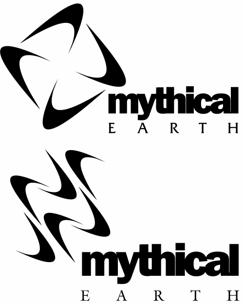
| Fig. 7: Mythical Whooshes |
| The first example shows the two final drafts of the logo created for Mythical Earth, a personal development company in Aruba. Both of the drafts (the customer finally selected the first one) are based on the expressive "whoosh" shapes repeated in a pattern. It's easy to see that on our chart, these whooshes would occupy the quadrant 3, as they feature a wide curvature range and emphatic disregard of the gravity direction (in fact, they were intended to symbolize some sort of space phenomena, such as comets' tails). The dynamism and freedom of each whoosh creates a strong contrast with the precise symmetric pattern formed by all of them, as well as with the horizontality of the text lines. |

| Fig. 8: The Smooth Flow of Vericode |
| The logo created for Vericode, a software testing company in Ashland, MA, exemplifies another corner of the curves universe. The inner contours of the "strait" are, too, of widely varying curvature, but this time they are strictly coordinated with the architectonic directions represented by the outer rectangular outline of the graphic (compare quadrant 4 on the chart). The resulting image stresses the qualities of reliability and smooth workflow that are important for Vericode. |
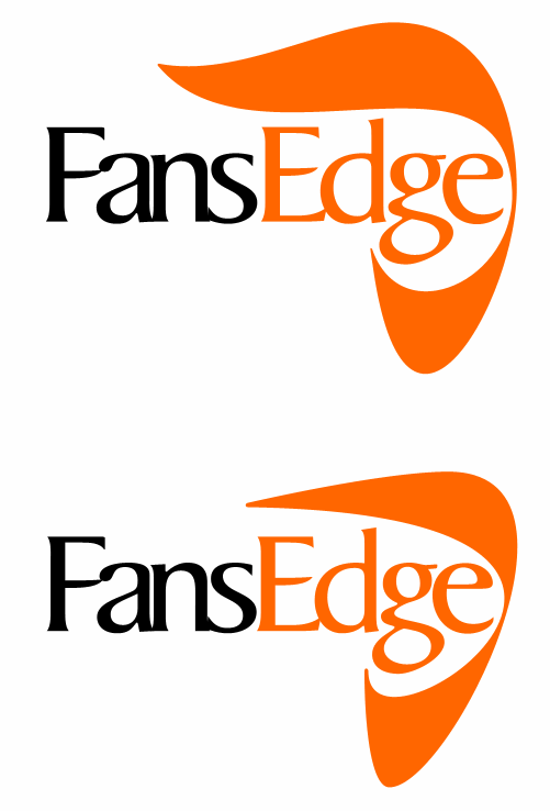
| Fig. 9: Fans on the Edge of Styles |
|
The last example is perhaps the most interesting, as it shows how
differently the same visual idea can be implemented depending on the
types of curves you use for it. The logos shown on Fig. 9 are the
two last drafts created for the FansEdge site, and the team of site creators was
being reportedly "very torn between the two logos," although their final
decision was in favor of the top draft which is "more distinctive."
(Please check out this logo's
full genealogy showing all of the earlier
variants that led to this final couple of images.)
Those who have carefully followed my discourse can see at once that the two logos shown on Fig. 9 occupy the quadrants 1 (the top draft) and 3 (the bottom draft) on the chart. In my view, the bottom variant with its acute curvature variations, asymmetric and dynamic shape would perhaps be a better match for the site's supposed audience of sports fans. On the other hand, the bottom version is somewhat lacking in architectonics, and since the text line doesn't attempt to provide a strong enough horizontal base, the whole thing may seem a bit unstable. On the contrary, the top logo is well balanced at the expense of losing much of the shape's dynamism. Although the lines used have low curvature range, their smooth flow and only a minimum loyalty to architectonics make the logo look pretty relaxed rather than artificial and "Modern Antiquean." The flirty curved tip at the top even gives the image a somewhat playful appearance, providing a visual counterpoint for the fancy Humanist Antiqua font used in the text. One final example of curvilinearity to which I would like to draw your attention has nothing to do with visual design, although it is very important in aircraft design and engineering. If you cut an airplane's wing parallel with the flight direction, the section will have a complex, smoothly streamlined shape called an airfoil. Modern airfoils come as a result of extensive research and experiments in aerodynamics labs, but their practical objective of generating maximum lift with minimum drag (air resistance) defines their aesthetic value which is obvious to everyone with an eye for the beauty of shapes. I'd recommend that those interested in non-linear design spend some time browsing the UIUC airfoils database, where each airfoil is shown as a GIF image. For an example, here's the CLARK Y airfoil (the wing's front edge is on the left), which is one of the most widely used - and isn't it beautiful! |
![]()
![]()
![]()
![]()
![]()
![]()
![]()
Revised: Feb. 12, 1999
URL: https://www.webreference.com/dlab/9902/examples-iii.html
 Find a programming school near you