Nonlinear Design. Architectonics
| Architectonics |
|
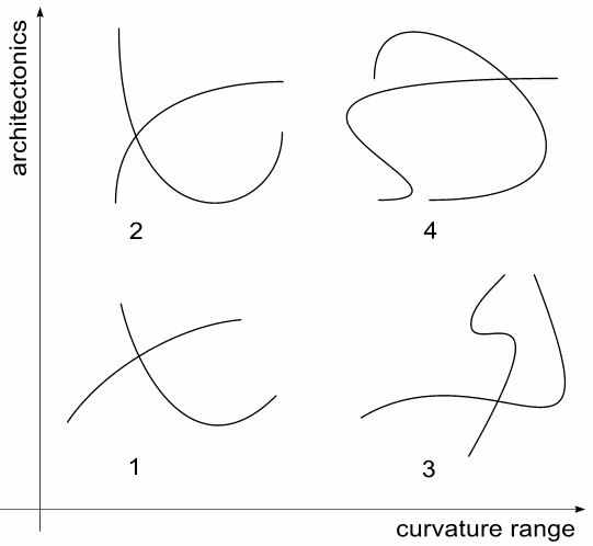
Of all design arts, architecture is perhaps most affected by the gravity, and no amount or creative originality can exempt an architect from the necessity to take horizontal and vertical directions into account. A building must align to a vertical, or it will simply fall (the Leaning Tower of Pisa is so famous exactly because it seems to break this universal law). So I think the term architectonics is quite appropriate for referring to the way a curve interacts with horizontal and vertical directions. Let's see what we get by using the curvature range and architectonics as the two axes of a planar coordinate system, trying to encompass the infinite variety of Bezier curves. In Fig. 4, the curvature range increases from left to right, and architectonics is the more expressive in the top row of figures than at the bottom. The four resulting quadrants exemplifying different combinations of these two parameters are quite interesting both by themselves and in comparison with each other. |

| Fig. 4: A chart showing the different values of curvature range and architectonics |
|
It is easy to see that when low curvature variability is accompanied by
an obvious neglect of architectonics (quadrant 1), the resulting
curves look very freehand, liberal, humanistic (as this term is defined
in my article on fonts). This style can be
used in expressive black-and-white artwork
intended to introduce a motive of elegant looseness into the
composition. An artist's goal in this case should be to fully preserve
the laxity of unrestrained lines while making a recognizable sketch of the
depicted object.
If, however, we try to coordinate low-curvature-range lines with horizontals or verticals, their character changes quite abruptly (quadrant 2). Besides dominant directions, architectonics often imply some general tendency to align or coordinate, some degree of overall symmetry and balance. When combined with the intrinsic symmetry and evenness of low-curvature Beziers, this tendency results in the overall feeling of softness, tranquility, and simple perfection. In design, this motif is most commonly implemented by rounded edges of rectangles which give the composition the characteristic "comfortable" look. In the world of wide curvature ranges, implications change once again. Non-architectonic expressive curves (quadrant 3) are not loose or relaxed as were those in quadrant 1. Instead, they convey the feeling of randomness, expressive unpredictability; they are reminiscent of physical particles' trajectories or complex celestial orbits in the directionless universe with no "top" or "bottom." Of all four quadrants, this one is the most powerful and persuasive realization of the very idea of a free Bezier curve. In quadrant 4, curvature variability and architectonics form an amalgamation which is impressive exactly because the nature of these two fundamental concepts is, to some extent, conflicting. In such curves, we're engaged to observe the opposition of emphatically curved shapes with uncompromisingly orthogonal verticals and horizontals. That's where Gothic architecture, Art Nouveau and Art Deco design styles drew much of their inspiration. So, we see that each part of our four-quadrant scheme has some set of associated meanings and connotations, which is a sign that our basic terms of analysis - curvature range and architectonics - are not irrelevant. Each of the above discussed types of curves has its own uses (and abuses) in design compositions, as we'll see in the next sections. |
Revised: Feb. 12, 1999
URL: https://www.webreference.com/dlab/9902/architectonics.html


 Find a programming school near you