Nonlinear Design. Examples I
| Examples I |
|
|
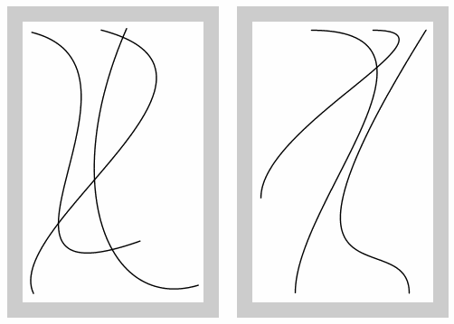
| Fig. 5: Creatively elaborating on quadrants 1 and 4 (see the chart in the previous section) |
|
So, you may see from this example how drastic a difference in perception
may ensue from the combination of the two factors that we're analysing.
The right composition, with its asymmetric balance and obvious pursuit
for perfection, is very expressive, perhaps even to the point of being a
bit ostentatious and strained. This image's appeal is more powerful and
immediate, although it also has a number of nuances that are only
obvious to an attentive eye.
The left image is, at the first glance, not so complicated visually, although I'd say that it may require a more educated and insightful perception. This composition tries to achieve the same goals of balance and perfection, but the deceptive looseness and even deliberate awkwardness of its outlines makes it more difficult to evaluate the results. If we try to identify possible historical prototypes, the left image may remind you of Picasso drawings, while the right one is not unlike some mannered Art Nouveau decorative compositions or Aubrey Beardsley's book illustrations. These images can exemplify another aspect of compositions with Bezier curves. Examining the right composition as a whole, we can see that curvature, besides defining the shape of the line, carries some visual weight that should be accounted for when analyzing the balance relations in the composition. Indeed, the sharper a line is bent at some point, the longer it takes a viewer to figure out the shape of that line fragment, and therefore, the greater is the visual importance that we subconsciously attach to that part of the image. For instance, in the right composition above, the concentration of features in the top right corner counterbalances the less populated center and bottom areas of the rectangle, which occupy a larger space but are not so rich in curvature extremities. From this viewpoint, the left composition is much more homogeneous, with its curvature distributed more or less evenly over the available space. |
![]()
![]()
![]()
![]()
![]()
![]()
![]()
Revised: Feb. 12, 1999
URL: https://www.webreference.com/dlab/9902/examples-i.html
 Find a programming school near you