The Art of Distortion. Shape-related effects
| Shape-related effects |
|
As you can easily see, the outline texture, i.e. the "peripheral component" of the fugure's texture, is closely related to the shape of the figure: As soon as the contour's asperities become large enough, we start to perceive them as features of the figure's shape rather than attributes of the outline. Here, form and texture demonstrate their inherent interrelation. To put it briefly, form melts into texture as it becomes more and more complex, tangled, dispersed (Fig. 1). |
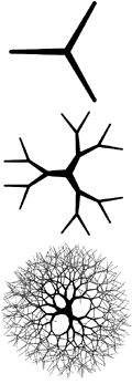
| Fig. 3: As it becomes more and more complex, this fractal form gradually changes into a texture |
|
As we've just seen, many graphic effects change the texture aspect of an
image. Not surprisingly, some of them change contour textures as
well as conventional surface textures. And just as surface
textures are most often distorted by the transformations (e.g. changed
from flat color to material and other complex texture types), so are
outlines, commonly turned from smooth lines into rough or jagged
ones. Therefore, to help you understand which surface
transformations go well with which shape distortions (and to complement
my previous article on simple geometric forms
in design), I will discuss here the amorphous, shapeless,
trenching-upon-texture forms that are common among highly "effectuated"
graphics.
Any shape not consisting of straight lines, or curved lines whose curvature is constant or changing according to a simple rule, are perceived as shapeless clouds by the human eye. Such forms are useful in cases when adding any crisp, geometric form would contradict to the existing ensemble of forms in the composition. For example, amorphous cloudy shapes are great for relatively large background images, those that partly underlie other elements of the page and therefore do not need to honor their linear boundaries. Thus, the most common shape editing technique is an irregular fade-out at the edges, a fuzzy cropping resulting in a shape which is not only non-linear but hardly discernible at all. This effect is directly related to the blur themes we've discussed in the previous section (for example, it is most often used with photographic images, while hand-drawn or abstract geometric shapes usually look less satisfying with this sort of figuration), although it's not the image itself that is blurred in this case, but instead the image's transparency mask. Modern design would suffer very much without this simple effect, just as modern music would not survive without the primitive volume fade-out finalizing the great majority of pop and rock songs. Another common technique with photographs is cutting them out of the background---without a gradual fade-out, but with a complex irregular shape (corresponding to that of the portrayed object) as a result. Quite naturally, while blurred edges are more often used with relatively large images, simple cut-outs work better for small, icon-sized images. It is not a good idea to force an amorphous image to "hang in the air" without any sort of support. Most often, such images abut against straight lines or linear elements surrounding them. Such adjoining intensifies the contrast of amorphism and geometry---which is unavoidable anyway, if only because the amorphous shape has no place to linger on other than a Web page with its outward rectangular frame. |
| The fundamental principle of balancing and contrasting regular and random forms may be realized in other aspects as well. Formlessness doesn't need to be fuzzy and cloudy---it may well be crisp-edged and even combine with certain regularity. For example, the slanted grid of equal-sized rectangles on this page forms an amorphous "cloud" dominating the page, and supported by the bullets randomly dispersed over the same regular grid below. This alloy of randomness and regularity helps to make a solid casting of a page. Note also the unmotivated dotted-line callouts that appear on rollover and lead to some random points of the rectangles' agglomeration. |
| Recently, the too geometric, "ethereal" character of modern computer art inspired a comeback of expressively life-like forms featuring untidy strokes with scratches, blotches, spatters, and other naturalistic artifacts. Of course, this "new realism" is usually implemented with a computer, although one of the goals of its creators is to make this fact hard to believe. This trend resulted in emerging a whole new brand of graphic software, of which the most notable are Painter and Expression. The proliferation of irregular shapes has even reached the logo design field, where traditionally only simple geometric forms were acceptable: see how the flower of the Nagano Olympic logo beautifully combines the necessary levels of symmetric balance and asymmetric irregularity. |
|

|
It is not easy to create a good amorphous shape, one which does not
annoy with its irregularity and does not clash with the regular
geometric forms surrounding it, so the specialized software tools may be
of great help. For an example of what may happen when one attempts to
inject some sort of pseudo-irregularity into a composition, have
a look at this page (it is rather content-free, which
only makes it easier to analyze the page's design features). Many
of the page's author's choices could be questioned, but what I'd like to
point out is that hand-drawn thin black stroke covering "Up.01" and,
partly, the photo. Obviously, this is a tribute to the
irregularity temptation, a deliberate attempt to "spice up" the
composition. But in reality, it only shows the author's
(subconscious, maybe) dissatisfaction about those parts of the page
which came out the worst---the line just strokes through the ugliest
parts of the page.
For a conclusion, what I would like to stress once again is that your main goal is to create a solid, coherent, tightly bound composition, rather than exercise your newest and coolest plug-ins on each of its elements. In the overwhelming majority of cases, this integrity goal can be effectively achieved by the most basic effects, either non-texturizing or the simplest texturizing ones. Most other effects have a too strong personality and feel uneasy in a composition unless they have an absolutely dominating role in it. |

![]()
![]()
![]()
![]()
Revised: Mar. 23, 1998
URL: https://www.webreference.com/dlab/9803/shape.html
 Find a programming school near you