The Art of Distortion. Texturizing effects | WebReference

The Art of Distortion. Texturizing effects

 
  Texturizing effects


With the exception of the simple effects described in the previous section, most graphic transformations result in changing the texture of the original image.  The diversity of these effects and their combinations is beyond imagination; the overview I present here cannot claim to be a comprehensive classification, only a series of casual observations.  In part, this is because the field is fairly new, with little or no roots in the design of pre-computer era, and is now developing at a mindboggling pace.  It's enough to glance at the clumsy, multi-level Filter menu in Photoshop to get a taste of the booming and feverish effects industry.


Link 3:  Blurring the background to accentuate the exquisite foreground typography
Nevertheless, some trends and rules can be outlined even in this seemingly messy field.  Let's start with various blur themes, which, from the texture standpoint, introduce the generic "soft" texture connatural to that of photographic images.  Effects of this group, like the color and brightness adjustments we've just discussed, are indispensable for creating an articulate hierarchy of elements: Blurred elements are always perceived as those which are less important, farther away (and therefore out of focus), closer to the background.  Fine Magazine provides a nice example of this simple "background" use of blurring, although this effect can have many other implications.  

  Sometimes, real-world objects are hard to delineate not because they're out of focus but because they're moving.  Thus, the effects of "Motion blur" and "Wind" (using Photoshop terminology), combining blurring with some directed smearing, are a standard way of assigning motion to a static object and amplifying the motion of a moving one (e.g. in an animated banner).  For example, on the wide, horizontally scrolling page of Ideo site, the "IDEO" heading at the top is motion-blurred horizontally to support the general horizontal flow of the composition, to stress the actual horizontal movement of the frame as it is being scrolled by the user.
Link 4:  This heading is moving fast as the frame's scrolling

  Yet another real-world source of blurred forms are shadows, which are never too crisp (because the sources of light are never sizeless dots).  Therefore, blurs are commonly used for drop shadows and other pseudo-3D effects. An artificial shadow is capable of adding an immediate and recognizable background plane, so that the main image becomes more prominent, closer and even (by contrast) crisper.  Adding a shadow plane is meaningful only if the graphic itself is flat and crisp-edged by its nature, that's why the 3D uses of blurring are much more common for text headings and geometric forms (as opposed to the two previous blur themes, usually applied to photographic images).

Related to blur themes are the various "soft" distortions which move around parts of the image, treating it as a gum plate (or, with another metaphor, reflecting it in a false mirror).  These effects, often implying some degree of blur as well, include "Ripple," "Smear," "Spherize," "Pinch," etc.  Usually, their effect is outright humorous if they're applied to an easily recognizable object, such as a human face (consider Kai's Power Goo, a great piece of entertainment software), and pretty dull otherwise (do you need a spherized cloud if, being equally shapeless after the transformation, it's hard to tell from the original?).  Sometimes, these tools are used to create 3D effects, e.g. of a "waving flag."

Blur and smear represent transformations which are independent of resolution; that is, if you take a version of the same image with twice as many pixels per inch and apply the same effects to it, doubling all pixel measurements in the effect's dialog window, the result will look exactly the same.  However, there are effects that do depend on the size of a single pixel, mostly because they make these pixels visible.  Here belong "Diffuse," "Mosaic," "Add noise," "Sharpen," as well as the web-inspired "diffusion dithering" (often unavoidable in GIF files).  In some sense, these effects are the opposite of the blur group; they can be useful by creating a specific "sandy" texture contrasting with blurred and flat-colored elements.

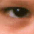
Also from the Web's GIF files comes the aesthetics of rendering a complex photographic image in just a few colors with no diffusion, generating wide flat-colored areas of peculiar forms.  Interesting variations of this theme can be obtained by tracing the image in a drawing program, as well as by applying some Photoshop filters such as "Cutout" (Fig. 2) or "Fresco."  The outspoken contrast of the obvious photographic origin of the image and its flat, anti-photographic texture is the zest of this sort of effects.


Figure 2, left              Figure 2, right

  Fig. 2:  The "Cutout" filter, applied to a photo, inverts the image's texture type  

  Most other filters are based on using some specific texture, most often of the naturalistic type (canvas, bricks, wood, various artistic materials), somehow "laid over" or "fused with" the original image.  The results may be pretty interesting, but only so far as the "master texture" is itself interesting and relevant in the composition.  As a rule, combining a texture with some image as its mount gives better results than using the same texture by itself (e.g. as the page's background).  

Created: Mar. 23, 1998
Revised: Mar. 23, 1998

URL: https://www.webreference.com/dlab/9803/text.html