The Art of Distortion. Non-texturizing effects
| Non-texturizing effects |
|
[Editor's note: as it was originally published in March of 1998, the external examples discussed on this page are no longer available. We have therefore removed the links.]
So why are these simple effects so important? As always, the simplest transformations often lie behind more complex ones, and even by themselves, the effects discussed below can powerfully change the perception of an image. It's not unreasonable to say that in the majority of cases (although not always) these non-texturizing effects are quite sufficient for creating a professional-looking design composition. This is especially true for transparent overlaying of images, which could well be called one of the main themes of modern design. Remember that the two most common texture types, flat color and photographic textures, are readily available in the source elements of your composition, so there's rarely a need to additionally texturize them with graphic effects. Instead, what is often needed is a method to build an articulate hierarchical system, to adjust the relative prominence of the elements---and for this task, simple non-texturizing effects are indispensable. Changing the overall brightness and saturation of an image is a very efficient method for promoting or demoting it in the composition, for assigning it the role of background or foreground at will. The general rule is simple: The more brightly and contrastingly colored an image, the more visible and prominent it is on the page. Most often, the original colored image turns out to be too bright for its intended role in the composition. In such cases you have to depress it somehow, using one of the following methods (the first being the strongest and the last, the weakest):
|
| These three methods can be combined with each other as well as with the original image---say, you can leave some parts of the image saturated and some not. For an example, visit the splash page of Capstone Studio, where the first two desaturation methods, applied to different parts of a photo, produce an abstruse symbolic picture quite appropriate for the main graphic theme of a design studio site. The unusual treatment of the title image, in fact, doesn't break the tradition of the composition center dominating over the periphery. |

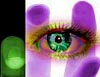
| Another, less successful example of using color properties for coordinating elements can be seen on the front page of Vivid Studios site. The left side of the page, with the 3D company logo and title at the top (in which the bold font face of "vivid" is beautifully balanced by a light and narrow---but spaced out---face of "studios"), is nearly perfect. However, the hand-and-eye composition on the right is more objectionable. For some mysterious reason, the designer chose to use green, and then magenta, for the monochromatic renderings of the hand image's halves. Both choices are problematic: Green is directly opposed to magenta on the color wheel, and therefore produces a contrast which is way too sharp (much sharper, in fact, than the contrast of black and white that the designer obviously intended to support by inverting one half of the hand image). What's even worse, the hand's magenta is distinctly different from the magenta of the logo strip on the left. |
|
|
As you'll recall, reducing a color image to the shades of one color is a
way of demoting it towards the background (although less powerful, of
course, than rendering it in grayscale). However, here the pair of
bright, directly opposite colors created a very prominent bunch of
material, nearly dominating on the page. Most probably, it was the
designer's original intention to use the hand as a background for the
foreground eye image on top of it; however, with so bright a background
it was insufficient to leave the foreground simply full-colored.
The solution that was found is, in my opinion, rather ugly, although it
cannot be denied certain logic: The designer has drastically
increased the saturation of the eye image, giving it the untidy,
"overdeveloped" look. (In fact, this inversion of the desaturation
technique transcends the non-texturizing class of effects---it
does change the perceived texture of an image.)
Besides desaturation, another method used for demoting a full-color image is blending it with the background (for example, increasing its brightness on white background or decreasing it on black background). This technique is even more common than desaturation (although it implies a certain level of desaturation as well), especially when there are more than one image to combine in a collage. Naturally, decreasing opacity of an image means making it less prominent, demotes it towards the background. For example, in the ad banner shown below, the two identical car images, one small and dark and the other large and faded, form the contrasting pair that holds together the entire composition. |

| Fig. 1: The contrast in this banner is pretty straightforward, but it glues the composition quite well |
| To summarize, non-texturizing effects are essential for creating stable connections and coordinating elements in a composition. You cannot just place an image on your page without adjusting its colors and brightness level, just as you cannot leave it without aligning its size and position. |
![]()
![]()
![]()
![]()
Revised: Mar. 23, 1998
URL: https://www.webreference.com/dlab/9803/non-text.html
 Find a programming school near you