Designing Site Navigation. Navigation Miscellanea
| Navigation Miscellanea |
|
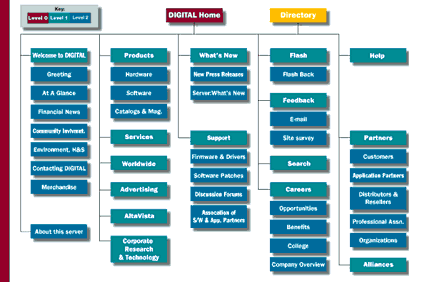
First off, don't let design concerns overcome your common sense. With every page, imagine you're a visitor that has just jumped here from some other site (not from your home page) and check if all links and buttons make sense in absence of the site context. It is not unfrequent to see that some buttons become completely irrelevant or even misguiding because of the content or role of a particular page. So don't be lazy to produce special versions of navigation panels for some of your pages. It is always a good idea to mark the button representing the page or section you're in as "disabled" (visually this may be achieved by changing the button's color, removing the light cast on it, etc; or with lists of textual links, it's enough to leave this item without link markup). This would give your audience an immediate clue of where they are and a better idea of where they may jump from here. Even if you don't want to visually alter disabled buttons, you should make sure there are no self-directed links (that is, buttons cannot be linked to the pages they're on). If your home page isn't overwhelmed by plenty of material, consider creating a large two-dimensional version of the navigation panel that might thus become a compositional center of the home page design. Such a wide panel may not only list the topical sections of your site, but illustrate them with photos and drawings, accompany them with extended textual comments, and even visualize the structure of links between them. Another use for a two-dimensional chart of your site is the site map, a navigation tool that any site with more than two levels of content hierarchy should carry. (Sometimes, a site map is a textual table of contents with links indented in accordance to their level in hierarchy.) For users, the site map is the last resort---they use it when they can't (or don't want to) puzzle out your usual navigation tools. That's why a site map should be the most logical, no-nonsense, no-eyecandy page on your site (a good example is again provided by Digital): Don't forget about the form input controls that, too, can be used for navigation. If you have a lot of one-level uniform choices, such as a list of countries or languages, consider using a drop-down list and a "Go" button. However, this technique is hardly appropriate for links that are either too few or too different in scope or meaning. Drop-out menus, coupled with some JavaScript, can be effectively used to navigate a two-level hierarchy, as is done on Webreference's front page. Large reference sites such as Yahoo or Webreference have deep dendriod structures of documents for which the conventional model of navigation with (almost) the same panel on each page would not be appropriate. Instead, such sites use hierarchical chains of links that represent higher-level subsections that need to be traversed in order to descend to the current page---the closest example is the "home / experts / dlab / 9705" chain of links at the top of the page you're reading. The last piece of advice concerns using graphic icons for links (such as those used by Yahoo). No doubt, icons can drastically improve the site's look-and-feel; with icons, one may consider "professional" the design that otherwise would be simply "nice." (Of course, even the most straightforward icons must be always accompanied by text labels.) However, be forewarned: Drawing a set of original, recognizable, consistent-style icons is an immensely difficult task even for a person with good design skills. ("Free icons collections" are no solution due to the poor quality of most of them and the next-to-impossibility to find something that would satisfactorily match your design.) After all, design and drawing are different, albeit interrelated, visual arts, and the latter obviously requires more inborn capabilities and training than the former. So if you feel you can't do without icons on your navigation bar, consider hiring a professional artist to create them. |
![]()
![]()
![]()
![]()
![]()
Revised: May 26, 1997
URL: https://www.webreference.com/dlab/9705/misc.html
 Find a programming school near you