Designing Site Navigation. Digital Equipment Corp.
| Digital Equipment Corp. |
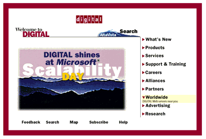   Note: Digital has changed the design of its site's home page (but not subpages). Now, the topics buttons are positioned in two horizontal rows above the row of tools, and the rollover effect replaces each topic button with its "floating tip" instead of displaying it below the button label. The below discussion refers to the old version of the home page design shown on the above illustration.
The first advantage to Digital's navigation system (as compared to Sun's) is that the buttons are of almost uniform length (at least, all of them fit in one line) and are provided with unambiguous marks identifying them as buttons (the triangles on the left). Although the panel has no visual accentuation but a thin vertical line (compare this to the Sun's gradient), it is easily perceived as a separate whole in the page design context. But the major attraction of Digital's home page panels is the simple animation applied to all active areas that change when you drag a mouse pointer over them (technically, this is a simple JavaScript trick called a "rollover," see this article for a full explanation). The effect of visual feedback to your every movement is exciting: it feels like the page is watching, with bated breath, for your slightest desires and itching to fulfill them. Not surprisingly, this technique has recently gained huge popularity; it is used on many corporate sites, e.g. that of Fractal Design Corp. Here, the rollover trick serves to not only make clicking real fun, but also to more effectively present the page's material: an additional text line below every button shows up when you point your mouse to it and disappears when you remove the mouse pointer. This is similar, in a way, to "floating tips" or status bar explanations for menu items in Windows applications. This way, you can pack a lot of easily accessible material on a relatively small space without encumbering it. This page also introduces us to a very important distinction. On nearly any site, it is easy to tell if a particular link belongs to the category of topics or the category of tools. Topics usually cover "What's new," "Products and Services," "Support," and similar sections delivering the "meat" of your site. Tools (usually less numerous than topics) include such options as "Search," "Site map," "Order/Buy," or "Feedback" (on subpages, a "Home" button is often added to the inventory of tools). In short, topics are what your visitors are after while tools are mostly about how to access the site's information. Digital's site is very consistent in separating topics and tools. Both are animated, but the topics are listed vertically to the right of the main visual, while tools are aligned horizontally at the bottom, below the visual. This is an almost canonical disposition (although topics are more often on the left and tools may be at the top), and you're advised to mind it in your design as well. On the technical side, note that each button on each panel is represented by its own separate graphic file. Here, it is a necessary prerequisite for using the animation technique, but the one-button-per-file approach delivers many advantages even if you aren't going to use any animation. First, you'll be able to easily reuse your buttons if for some reason you'll need a modified version of the panel for another page (with some buttons added or removed). Second, this way you can provide each button with its own ALT text thereby facilitating navigation for graphic-impaired users. And third, with GIF files this would allow for each button to have a separate palette of its own, therefore improving the color rendering on high color or true color systems (i.e. those which do not dither all images to one fixed palette). Certainly, the Digital navigation panels also have a couple of things that can be criticized. For example, there exist two approaches to choosing the buttons' widths in horizontal navigation bars: either they all are of equal width or they depend on the width of text labels they contain. In your work, you should decide which of the two approaches better matches your design and stick to it. However, on the Digital home page, the Tools buttons at the bottom do not seem to follow any of these principles. |
 ow let's go to the home page of Digital Equipment Corp. at
Revised: Sep. 20, 1997
URL: https://www.webreference.com/dlab/9705/dec.html
 Find a programming school near you