Designing Site Navigation. Delving Deeper
| Delving Deeper |
|
The navigation equipment on subpages on the Sun site is very different from that on the home page. The topical links are completely absent, and the tool links are reduced to the Home and Search buttons on the panel at the top (whose design, although nice by itself, has precious little in common with the design of the home page navigation bar). This panel, combining the logo, page heading, and the two tools icons, is the only graphic interface element that is more or less consistent throughout most of Sun's pages. Sun's site is a big one, so many of the pages accessible from the home page contain further subtrees of linked documents below them. Unfortunately, these second-order navigation bars don't even remotely resemble the main navigation panel---they're just centered lines of textual links separated by |'s. This economic approach results in a site that's really hard to navigate. There are more design faults to this site, but I'd rather stop pinpointing them here for the fear of alienating my readers. Please don't get me wrong; I'm not "getting at" Sun's design for the pleasure of doing so. (For those interested in logos, I consider the Sun logo one of the best I've ever seen.) But I believe that a bad example accompanied with an explanation of what's so bad about it is no less instructive than a good one. Apparently, Digital designers seem to better understand the importance of the entire site having a consistent navigational interface. Indeed, if someone has spent even a couple seconds on the home page figuring out where to descend, this means s/he's got somehow accustomed to the design and navigation tools on the page. This acquired knowledge of your users should not be wasted, but profited upon.
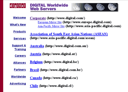
We see that each of the subpages on www.digital.com contains almost the same set of topic links as does the home page, in the same order. These links are in a vertical column to the left from the body text and use plain text without any graphics, let alone animation---this makes the transition from the home page to subpages a little bit too sharp, but keeping the consistent order and vertical alignment still helps to maintain integrity of perception and ease of navigation. Also on the downside, on this particular page, the links at the left are too close and too similar to the list on the right---it's difficult to avoid the impression that all careers are made in Austria, all alliances, in Belgium, and all partners live in Brazil. The tools buttons ("Feedback," "Search," "Map," etc.) are also the same on subpages as on the home page; they're aligned horizontally at the bottom of each subpage, and they reuse the graphics and animation code of the home page. There's only one significant addition: the "DIGITAL home" button located, as required by tradition, on the very left of the panel. (The leftmost position of such a button can be taken over only by the "Previous" or "Back" sort of buttons, if these are present.) |
![]()
![]()
![]()
![]()
![]()
Revised: May 26, 1997
URL: https://www.webreference.com/dlab/9705/delving.html
 Find a programming school near you