CSS Mastery: Advanced Web Standards Solutions | Part 2/Page 3
[previous] [next]
CSS Mastery: Fixed-Width, Liquid, and Elastic Layouts and Faux Columns
Liquid and elastic images
If you choose to use a liquid or an elastic layout, fixed-width images can have a drastic effect on your design. When the width of the layout is reduced, images will shift and may interact negatively with each other. Images will create natural minimum widths, preventing some elements from reducing in size. Other images will break out of their containing elements, wreaking havoc on finely tuned designs. Increasing the width of the layout can also have dramatic consequences, creating unwanted gaps and unbalancing designs. But never fear—there are a few ways to avoid such problems.
For images that need to span a wide area, such as those found in the site header or branding areas, consider using a background image rather than an image element. As the branding element scales, more or less of the background image will be revealed:
If the image needs to be on the page as an image element, try setting the width of the container element to 100% and the overflow property to hidden. The image will be truncated so that it fits inside the brandingelement but will scale as the layout scales:
For regular content images, you will probably want them to scale vertically as well as horizontally to avoid clipping. You can do this by adding an image element to the page without any stated dimensions. You then set the percentage width of the image, and add a max-width the same size as the image to prevent pixelization.
Remember that max-width only works in more modern browsers such as Safari and Firefox. If you are concerned about the image pixelating in older browsers, make the image as large as you will ever need it to be.
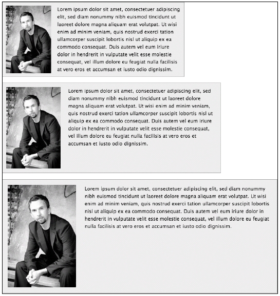
For example, say you wanted to create a news story style with a narrow image column on the left and a larger text column on the right. The image needs to be roughly a quarter of the width of the containing box, with the text taking up the rest of the space. You can do this by simply setting the width of the image to 25% and then setting the max-width to be the size of the image—in this case 200 pixels wide:
As the news element expands or contracts, the image and paragraphs will also expand or contract, maintaining their visual balance (see Figure 7-10). However, on standards-complaint browsers, the image will never get larger than its actual size.

Figure 7-10. Giving images a percentage width allows them to scale nicely in relation to their surroundings.
[previous] [next]
URL:


 Find a programming school near you