CSS Mastery: Advanced Web Standards Solutions | Part 2/Page 2
[previous] [next]
CSS Mastery: Fixed-Width, Liquid, and Elastic Layouts and Faux Columns
Elastic layouts
While liquid layouts are useful for making the most of the available space, line lengths can still get uncomfortably long on large resolution monitors. Conversely, lines can become very short and fragmented in narrow windows or when the text size is increased a couple of steps. If this is a concern, then elastic layouts may be a possible solution.
Elastic layouts work by setting the width of elements relative to the font size instead of the browser width. By setting widths in ems, you ensure that when the font size is increased the whole layout scales. This allows you to keep line lengths to a readable size and is particularly useful for people with reduced vision or cognitive disorders.
Like other layout techniques, elastic layouts are not without their problems. Elastic layouts share some of their problems with fixed-width layouts, such as not making the most use of the available space. Also, because the whole layout increases when the text size is increased, elastic layouts can become much wider than the browser window, forcing the appearance of horizontal scroll bars. To combat this, it may be worth adding a max-width of 100% to the body tag. max-width isn't currently supported by IE 6 and below, but it is supported by standards-complaint browsers such as Safari and Firefox.
Elastic layouts are much easier to create than liquid layouts as all of the HTML elements essentially stay in the same place relative to each other; they just all increase in size. Turning a fixed-width layout into an elastic layout is a relatively simple task. The trick is to set the base font size so that 1em roughly equals 10 pixels.
The default font size on most browsers is 16 pixels. Ten pixels works out at 62.5 percent of 16 pixels, so setting the font size on the body to 62.5%does the trick:
Because 1em now equals 10 pixels at the default font size, we can convert our fixed-width layout into an elastic layout by converting all the pixel widths to em widths:
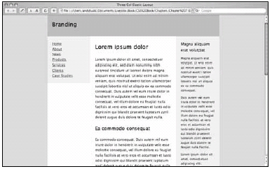
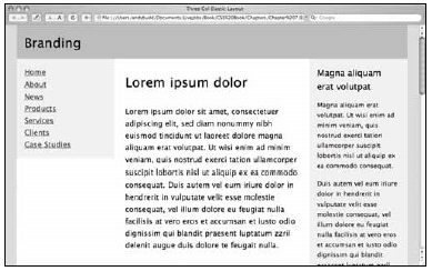
This produces a layout that looks identical to the fixed-width layout at regular text sizes (see Figure 7-7), but scales beautifully as the text size is increased (see Figure 7-8).

Figure 7-7. Elastic layout at the default text size

Figure 7-8. Elastic layout after the text size has been increased a few times
Elastic-liquid hybrid
Lastly, you could choose to create a hybrid layout that combines both elastic and liquid techniques. This hybrid approach works by setting the widths in ems, then setting the maximum widths as percentages:
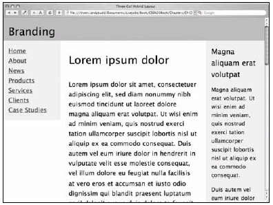
On browsers that support max-width, this layout will scale relative to the font size but will never get any larger than the width of the window (see Figure 7-9).

Figure 7-9. The elastic-liquid hybrid layout never scales larger than the browser window.
[previous] [next]
URL:


 Find a programming school near you