CSS Mastery: Advanced Web Standards Solutions - Part 2
[next]
CSS Mastery: Fixed-Width, Liquid, and Elastic Layouts and Faux Columns
Fixed-width, liquid, and elastic layout
So far (in the previous article), all the examples have used widths defined in pixels. This type of layout is known as fixed-width layout, or sometimes "ice layout" due to its rigid nature. Fixed-width layouts are very common as they give the developer more control over layout and positioning. If you set the width of your design to be 720 pixels wide, it will always be 720 pixels. If you then want a branding image spanning the top of your design, you know it needs to be 720 pixels wide to fit. Knowing the exact width of each element allows you to lay them out precisely and know where everything will be. This predictability makes fixed-width layout by far the most common layout method around.
However, fixed-width designs have their downsides. First, because they are fixed, they are always the same size no matter what your window size. As such, they don't make good use of the available space. On large screen resolutions, designs created for 800 600 can appear tiny and lost in the middle of the screen. Conversely, a design created for a 1024 760 screen will cause horizontal scrolling on smaller screen resolutions. With an increasingly diverse range of screen sizes to contend with, fixed-width design is starting to feel like a poor compromise. Another issue with fixed-width design revolves around line lengths and text legibility. Fixed-width layouts usually work well with the browser default text size. However, you only have to increase the text size a couple of steps before sidebars start running out of space and the line lengths get too short to comfortably read.
To work around these issues, you could choose to use liquid or elastic layout instead of fixed-width layout.
Liquid layoutsWith liquid layouts, dimensions are set using percentages instead of pixels. This allows liquid layouts to scale in relation to the browser window. As the browser window gets bigger, the columns get wider. Conversely, as the window gets smaller, the columns will reduce in width. Liquid layouts make for very efficient use of space, and the best liquid layouts aren't even noticeable.
However, liquid layouts are not without their own problems. At small window widths, line lengths can get incredibly narrow and difficult to read. This is especially true in multicolumn layouts. As such, it may be worth adding a min-widthin pixels or ems to prevent the layout from becoming too narrow.
Conversely, if the design spans the entire width of the browser window, line lengths can become long and difficult to read. There are a couple of things you can do to help avoid this problem. First, rather than spanning the whole width, you could make the wrapper span just a percentageÂsay, 85 percent. You could also consider setting the padding and margin as percentages as well. That way, the padding and margin will increase in width in relation to the window size, stopping the columns from getting too wide, too quickly. Lastly, for very severe cases, you could also choose to set the maximum width of the wrapper in pixels to prevent the content from getting ridiculously wide on oversized monitors.
Be aware that IE 5x on Windows incorrectly calculates padding in relation to the width of the element rather than the width of the parent element. Because of this, setting padding as a percentage can produce inconsistent results in those browsers.
You can use these techniques to turn the previous fixed-width, three-column layout into a fluid, three-column layout. Start by setting the width of the wrapper as a percentage of the overall width of the window. In this example I have chosen 85 percent as it produces good results on a range of screen sizes. Next, set the width of the navigation and content areas as a percentage of the wrapper width. After a bit of trial and error, setting the navigation area to be 23 percent and the content area to 75 percent produced nice results. This leaves a 2-percent virtual gutter between the navigation and the wrapper to deal with any rounding errors and width irregularities that may occur:
You then need to set the widths of the columns in the content area. This gets a bit trickier as the widths of the content divs are based on the width of the content element and not the overall wrapper. If you want the secondaryContent to be the same width as the main navigation, you need to work out what 23 percent of the wrapper is in terms of the width of the content area. This is 23 (width of the nav) divided by 75 (width of the content area), multiplied by 100Âwhich works out at around 31 percent. You will want the gutter between the content columns to be the same width as the gutter between the navigation and content areas. Using the same method, this works out to be around 3 percent, meaning that the width of the main content area should be 66 percent:
This produces a liquid layout that is optimal at 1024 780 but is comfortable to read at both larger and smaller screen resolutions (see Figure 7-6).
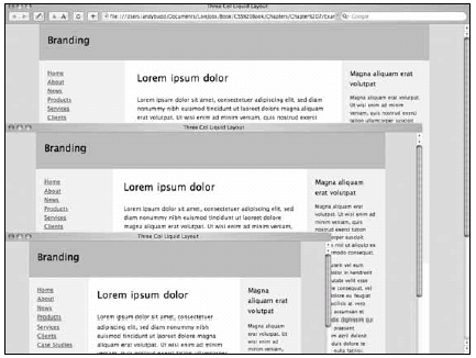
Figure 7-6. Three-column liquid layout at 800x600, 1024x768, and 1152x900
Because this layout scales so nicely, there isn't any need to add a max-width property. However, the content does start to get squashed at smaller sizes, so you could set a minimum width of 720pxon the wrapper element if you liked.
[next]
URL:
 Find a programming school near you