CSS Mastery: Advanced Web Standards Solutions | Part 2/Page 4
[previous]
CSS Mastery: Fixed-Width, Liquid, and Elastic Layouts and Faux Columns
Faux columns
You may have noticed that the navigation and secondary content areas on all these layouts have been given a light gray background. Ideally the background would stretch the full height of the layout, creating a column effect. However, because the navigation and secondary content areas don't span the full height, neither do their backgrounds.
To create the column effect, you need to create fake columns by applying a repeating background image to an element that does span the full height of the layout, such as a wrapper div. Dan Cederholm coined the term "faux column" to describe this technique.
Starting with the fixed-width, two-column layout, you can simply apply a vertically repeating background image, the same width as the navigation area, to the wrapper element (see Figure 7-11):
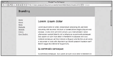
Figure 7-11. Faux fixed-width column
For the three-column fixed width layout, you can use a similar approach. This time, however, your repeating background image needs to span the whole width of the wrapper and include both columns (see Figure 7-12). Applying this image in the same way as before creates a lovely faux two-column effect (see Figure 7-13).
![]()
Figure 7-12. Background image used to create the faux three-column effect
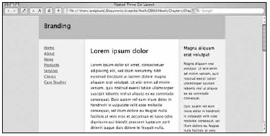
Figure 7-13. Faux three-column effect
Creating faux columns for fixed-width designs is relatively easy, as you always know the size of the columns and their position. Creating faux columns for fluid layouts is a little more complicated; the columns change shape and position as the browser window is scaled. The trick to fluid faux columns lies in the use of percentages to position the background image.
If you set a background position using pixels, the top-left corner of the image is positioned from the top-left corner of the element by the specified number of pixels. With percentage positioning, it is the corresponding point on the image that gets positioned. So if you set a vertical and horizontal position of 20 percent, you are actually positioning a point 20 percent from the top left of the image, 20 percent from the top left of the parent element (see Figure 7-14).
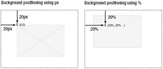
Figure 7-14. When positioning using percentages, the corresponding position on the image is used.
This is very useful as it allows you to create background images with the same horizontal proportions as your layout, and then position them where you want the columns to appear.
To create a faux column for the navigation area, you start by creating a very wide back-ground image. In this example, I have created an image that is 2000 pixels wide and 5 pixels high. Next you need to create an area on the background image to act as the faux column. The navigation element has been set to be 23 percent of the width of the wrapper, so you need to create a corresponding area on the background image that is 23 percent wide. For a background image that is 2000 pixels wide, the faux column part of the image needs to be 460 pixels wide. Output this image as a GIF, making sure that the area not covered by the faux column is transparent.
The right edge of the faux column is now 23 percent from the left side of the image. The right edge of the navigation element is 23 percent from the left edge of the wrapper element. That means if you apply the image as a background to the wrapper element, and set the horizontal position to be 23 percent, the right edge of the faux column will line up perfectly with the right edge of the navigation element.
secondaryContent element relative to the wrapper. Because the wrapper element already has a background image applied to it, you will need to add a second wrapper element inside the first. You can then apply your second faux column background image to this new wrapper element.
If you have worked out your proportions correctly, you should be left with a beautiful three-column liquid layout with columns that stretch the height of the wrapper (see Figure 7-15).
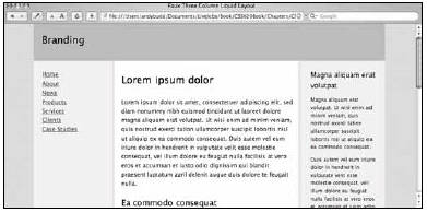
Figure 7-15. Faux three-column layout
Summary
In this chapter you learned how to create simple two- and three-column fixed-width lay-outs using floats. You then learned how these layouts could be converted into liquid and elastic layouts with relative ease. You learned about some of the problems associated with liquid and elastic layouts and how liquid images and hybrid layouts can help solve some of these problems. Lastly, you saw how to create full height column effects on both fixed-width and liquid layouts, using vertically repeating background images. This chapter touched on some of the techniques used to create CSS-based layouts. However, there are a lot of techniques out there, enough to fill a whole book of their own.
One of the big problems developers face with CSS layouts is that of browser inconsistency. To get around browser rendering issues, various hacks and filters have been created. In the next chapter, you will learn about some of the better-known hacks and how to use them responsibly.

This content is excerpted from, "CSS Mastery: Advanced Web Standards Solutions", authored by Andy Budd with Cameron Moll and Simon Collison. The content represents pages 141 to 152, from the chapter, "Layout". The book is published by friends of ED, © copyright 2006 by Andy Budd, Cameron Moll, and Simon Collison. All rights reserved. Reprinted with permission. ISBN 1590596145).
[previous]
URL:


 Find a programming school near you