WebReference.com - Part 1 from Chapter 11 of Cascading Style Sheets A Beginner's Guide, from Osborne/McGraw-Hill (3/6)
[previous] [next] |
CSS: A Beginner's Guide
Box Dimensions
The actual size of a box depends on a number of different factors. As you have already learned, padding, borders, and margins can affect a box's size. However, if all of these are left at their default value of "zero," a box will take on the width of its containing block. For example, if you have an <h2> element that is the child of the <body> element, then the <h2> box should be as wide as the browser window, as in the following illustration:

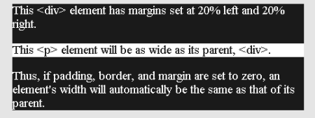
However, try inserting a <div> element onto the page and setting its margins so that it does not take up the full browser window (say, 20% left and right). Then, put a <p> element inside the <div>. The <p> element's box should be the same width as that of the <div>, as the following illustration demonstrates.

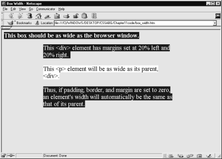
A quirk of Netscape 4 is that it treats block boxes as if they were inline, ending the boxes with their content, instead of extending them to the width of the parent. Keep this in mind as you begin to work with boxes in CSS. As you can see in the following illustration, the layout looks very different.

<html><head><title>Box Width</title>\
<style>
body   {font-size: 1.2em; background-color: silver;}
h3     {background-color: blue; color: white;}
div    {margin-left: 20%;
        margin-right: 20%;
        background-color: blue;
        color: white;}
p      {color: blue; background-color: white;}</style>
</head>
<body>
<h3>This box should be as wide as the browser window.</h3>
<div>This <div> element has margins set at 20% left
     and 20% right.
<p>This <p> element will be as wide as its parent,
   <div>.</p>
Thus, if padding, border, and margin are set to zero,
an element's width will automatically
be the same as that of its parent.
</div></body></html>
Tip: Browsers are supposed to compute and adjust a box's width based on a formula that combines the values of seven properties into a total that equals the width of the parent element (containing box). The formula is: margin-left + border-left + padding-left + width + padding-right + border-right + margin-right = width of parent element.
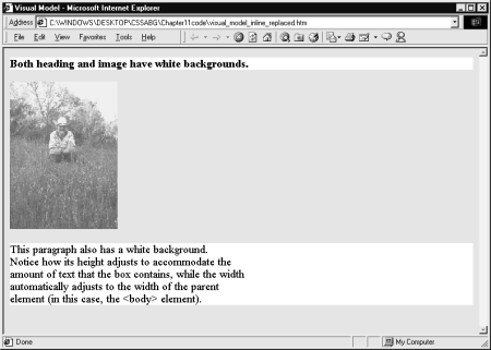
While a box's width is determined by its containing block, its height will generally be determined by its contents. Notice in the preceding illustration how the box adjusts vertically to accommodate its contents. If the box contains a replaced element (an image for example), the box takes on the size and width of the replaced contents. For example, if a box contains an image that has dimensions of 200 pixels by 400 pixels, the box will take on those dimensions. The following illustration shows three elements: <h3>, <img />, and <p>. The background color for each has been set to white. Notice how the <h3> and <p> elements show a background that extends completely across the browser window, while the <img /> element shows no background at all. This is because the <img /> element is an inline replaced element, and its "box" automatically adjusts to the image's dimensions.

If you do not want the browser to automatically set the dimensions of a box, there are some properties you can use to set them yourself.
Hint: A replaced element is an element that is actually "replaced" by some other content. For example, the <img /> element is a replaced element because it basically serves as the placeholder for a graphical image that will be inserted in the document. Another replaced element is the <object> element. Keep in mind that for a replaced element to take on the width and height of its content before the rest of the page loads, you must supply those values, either with HTML's width and height attributes or with CSS's width and height properties. If you don't do this, the page will take longer to load.
[previous] [next] |
Created: July 8, 2002
Revised: July 8, 2002
URL: https://webreference.com/authoring/style/sheets/beginners/chap11/1/3.html


 Find a programming school near you