3D Animation Workshop: Lesson 51: Nendo - Innovation in Modeling
|
|
Lesson 51 - Nendo--Innovation in Modeling - Part 1
Every now and then, something really new comes along. Not just new to be different, but new in a way that makes us rethink ideas that we've held onto for a while.
The remarkable Nendo modeler from Nichimen Graphics is just such a product. It is so revolutionary, on so many fronts, that all serious 3D practitioners must give it a serious look. Nichimen is famous for the powerful N-Worlds package that holds a respected place in the games industry. But while N-Worlds is expensive and intimidating to the newcomer, Nendo is absurdly inexpensive and welcoming. By inexpensive, I mean that it costs $99. Yes, you read that correctly. $99. And it can be purchased online from Nichimen. That a serious, professional quality 3D modeler might be available at such a low price point is radical enough. But as important as the low price is, the design of the application--its ease of use and effortless, intuitive feel--is an even more significant development in a world in which professional 3D tools feel more like a NASA cockpit than an artist's studio. Many people who are now working in the high-end 3D packages, may well decide to move much of their modeling work to Nendo, and then import into their regular package for rendering and animation.
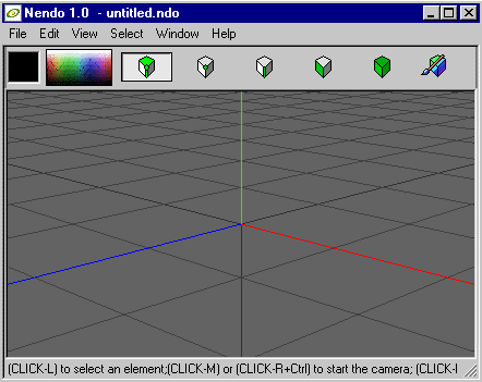
Take a look at the Nendo screen.

Even shrunk down to this tiny size, there is nothing missing from the tool bar. The central icons allow the user to choose between working on an entire object, selected faces (polygons), edges, or points (vertices). There's even a context sensitive selection tool that chooses whichever of these elements that the user happens to place the cursor over. Selection is so easy that one can begin to work fluidly, and therefore more creatively. And notice that there is only one window, a perspective view that can be rotated and zoomed with ease from the mouse buttons. Leaving out orthographic windows (front, top, side) is a big move, and one that definitely makes certain kinds of modeling more difficult. But I have been surprised to discover how effectively one can work without them.
As the entire appeal of Nendo (apart from the price) is the intuitive feel, let's pass through the process of modeling a stylized dog's head. I'm using a model from a tutorial provided with Nendo (with some modifications) because it demonstrates the strengths of the program so well. Let's just roll visually through the process, with comments.
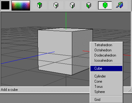
The reason the screen in Nendo remains so uncluttered is because most relevant menu choices are available when the user presses the right mouse button. The choices are context sensitive. For example, with nothing selected, the menu permits us to create a new primitive object. We start with a cube.

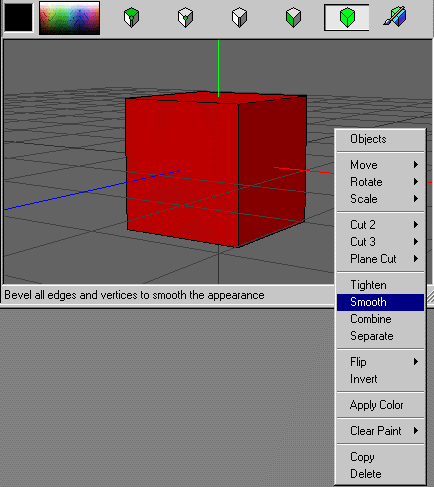
With the cube now selected (in red), the right-click menu gives us the range of options for editing a complete object. We choose "smooth" to subdivide and round the cube--a tool much like metaform in Lightwave or mesh smooth in Studio MAX.

| To Continue to Parts 2 and 3, Use Arrow Buttons |
|
Created: Oct. 13, 1998
Revised: Oct. 13, 1998
URL: https://webreference.com/3d/lesson51/


 Find a programming school near you