3D Animation Workshop: Lesson 19: Good Enough to Eat | 3
|
|
Lesson 19 - Good Enough to Eat - Part 3

We've already noted how one element of a surface is typically most important in selling the object. For the apple, it was the diffuse color pattern (although specularity was also important). For the lemon, it's the texture.
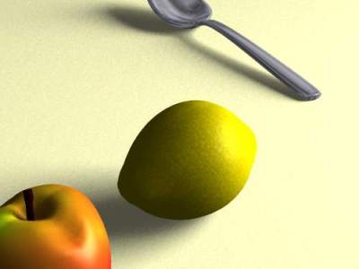
A lemon is all one diffuse color, and its most distinctive feature is the pebbly surface which is common to all citrus fruits. We were introduced to the many overlapping techniques for creating the impression of surface texture in Lesson 13. Let's focus only on BUMP MAPPING here.
If you take a good look at a real lemon and compare it with the image above, you can see how much we've cheated. The texture of a real lemon is defined by small dots impressed into the surface, and these dots are of a contrasting color to the basic yellow that we associate with the fruit. Creating a surface of such subtlety is hard work, and may not be necessary, especially at the size the lemon is rendered in the completed scene. There is much to be learned from realistic painting in this regard. Most people do not really know exactly what the surface of a lemon looks like, although they think they do. If you give them what they expect--or rather, most of it--they will often accept the object as realistic.
Bump maps are commonly produced from photographs of actual surfaces, but here we used a procedural texture to create a very fine, but somewhat random, pattern of small bumps. The most important parameter in applying a bump map is amplitude. This factor determines how great the relief effect will be for the given pattern. The greater the amplitude, the higher the peaks will be and deeper the valleys.
Compare the image above with the following render, in which the amplitude has been doubled.

This greater texture may actually be a more plausible alternative with the larger size of the lemon here. But it also gives the surface a darker cast attributable to the deeper shadows caused by the relief. A possible fix might be to bring down the intensity of the lit side of the lemon, by reducing specularity or the diffuse color response, or both.
The other important parameter in this surface is the size or scale of the pattern. With fine textures, small differences in the scale make a strong difference.
Here is a render applying the same pattern at twice the size as in the original.

Compare this carefully with the image at the top of the page. By spreading out the pattern, a certain strict realism is degraded. The bump pattern on a real lemon is not as diffused as in this last render. But the new image has a certain softness that causes the viewer to interpret the scene a bit differently, and with greater tolerance for the lack of strict realism. Sometime we err in inviting to close an inspection of our work. With a gentler, soft focus effect, the viewer may be more satisfied with the lemon, especially in contrast with the crispness of the spoon. There is no way to separate the question of esthetic pleasure from that of realism.
Next time we'll fishing with this project with an introduction to ray-tracing effects. See you next week!
| To Return to Parts 1 and 2, Use Arrow Buttons |
|
Created: September 2, 1997
Revised: September 2, 1997
URL: https://webreference.com/3d/lesson19/part3.html


 Find a programming school near you