3D Animation Workshop: Lesson 19: Good Enough to Eat | 2
|
|
Lesson 19 - Good Enough to Eat - Part 2
PROCEDURAL SHADERS vary from application to application, but all programs will have a method of creating random, cloudy blends of assigned colors or shades of gray. One of the obvious advantages to using a procedure here to create a texture map is that small variations in the parameters will give us sufficiently different maps for each of the two apples. Had a photo or a hand-painted image map been used, such variation would not have been so easy.
A lucky break has also helped us out. We want our colors to blend from red, through yellow, to green. This is a natural result in the world of computer colors, where the primaries are red, green and blue. In this system, yellow is a mix of red and green, and this is perfect for us. By contrast, in the world of pigments the primary colors are red, yellow and blue. If red paint is mixed with green (its complementary color), the result is a muddy brown. Thus a cloudy procedural shader using red and green will provide an overlapping area of yellow, just as a real apple does.
Getting procedure settings just right generally takes a lot of experimentation. Don't let this time go to waste! Always treat surfacing problems as a chance to learn, and be prepared to discover ideas that will work on other projects.
The following image shows the same procedure at a setting 10 times as dense as the original on one of the apples.
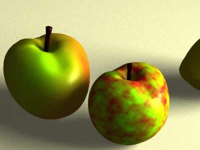
The pattern is precisely the same as on the final product, only scaled down. This gives us a good sense though of how the pattern works, and we can readily understand that we need only a very small portion of it, spread out over the object.
The following image takes blending in the pattern to an extreme.
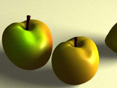
In this image, the scale of the pattern has been restored to its original state, but the two colors have been spread out so much that they completely overlap. From this example, it becomes clear that in an RGB color system, the blend of red and green produces yellow.
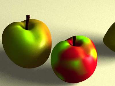
An extreme in the other direction is to eliminate most of the blending. The following image suggests a direction we might go toward the skin of a mango, if the scale of the pattern were increased.
Taking all of these parameters into account, we might have a new idea for a plausible surface, one more like a Gala apple than our Fuji.
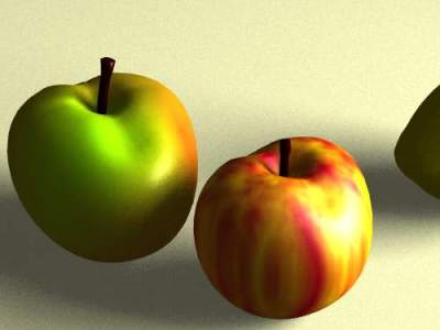
In this surface, the scale of the pattern is much smaller, but unlike the example earlier on this page, the scale is not the same in all three dimensions. To create vertical streaks, the pattern is reduced to 1/10th scale in the x and y dimensions, but remains at the original scale in the y dimension. Greater color contrast is obtained by reducing the blending, though not so much as in the preceding example. And, of course, the green in the pattern was replaced with yellow.
Specular reflection is important on an apple, and in the last example, the Gala version has had its specular parameters altered for comparison. The original Fuji surface to the left has sharp highlights. On the Gala, the specular reflection (although identical in intensity) has been spread out so that the surface appears less shiny. This small difference lends variety to the scene.
So what about the lemon?
| To Continue to Part 3, or Return to Part 1, Use Arrow Buttons |
|
Created: September 2, 1997
Revised: September 2, 1997
URL: https://webreference.com/3d/lesson19/part2.html
 Find a programming school near you