3D Animation Workshop: Lesson 19: Good Enough to Eat
|
|
Lesson 19 - Good Enough to Eat - Part 1
Last time, we explored how light and shadow contribute to the atmosphere of a convincing photorealistic scene. In this lesson, we'll be looking into the surfacing of the individual objects.
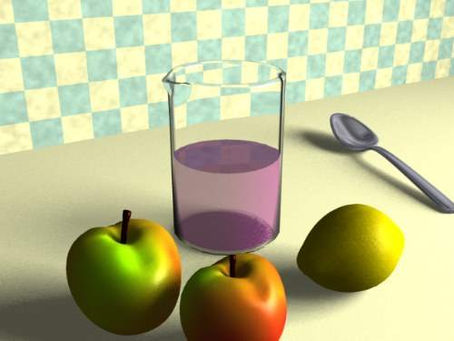
Here's the finished scene again, for reference.

To a large extent, of course, realistic objects depend on accurate modeling. But the geometry of real-world objects can very often be impossible or impractical to create. Some objects will simply have too much geometric detail. Organic objects will often have a subtly of curvature that either defies the artist's available modeling tools, or will take far too much work to simulate with close accuracy.
It's therefore both comforting and valuable to understand that good surfacing hides a multitude of modeling deficiencies. It is a simple fact of perception that a viewer will forgive inadequate geometry if an object is well surfaced. The apples in this scene make this point clearly.
At the size of the apples in the complete scene, there is little opportunity for close inspection of their geometry. The color and specular qualities, however, say "apple," and so the viewer happy to accept the fruit with all its geometric flaws.
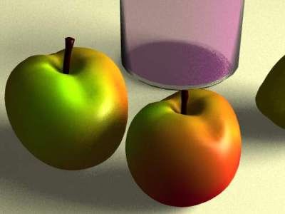
If the apples fill a larger portion of the scene, the geometric deficiencies are more obvious.

The apples are a little too round, perhaps. The dimples are not tight enough. And at this scale, it's obvious that both apples are copies of the same model with only slight modifications (though different surface colors). Even so, the surfacing goes a long way toward maintaining a satisfying sense of realism.
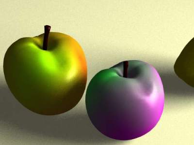
Every type of realistic object seems to have a particular surfacing aspect that is more important than any other. In the case of the apples, it's the DIFFUSE COLOR, or rather the mix of diffuse colors. Even an all-red or all-green apple has a lot of characteristic color variation, but an apple (like the now-popular Fuji) that blends from red to green makes a great surface--not just because it is esthetically pleasing, but also because it is a color pattern so uniquely identifiable with an apple. We have specifically chosen a surface color that "sells" an apple.
To make the point, let's change the colors on one of the apples.

As we need a blend of colors rather than a single value, we need a TEXTURE MAP for our diffuse color. A photograph of an apple surface might be a place to start, but might work very well. A bitmap image must wrap all the way around the object in a way that no conventional photograph will serve. Another possibility would be to paint a bitmap in a paint program using an apple as a guide. This, however, is likely to be difficult because of the distortion that occurs when wrapping the image around the irregular object, and particularly into the well at the top from which the stem emerges. With enough effort, a very satisfactory texture map could be so painted, but there is an easier way available here that will work well enough.
| To Continue to Parts 2 and 3, Use Arrow Buttons |
|
Created: September 2, 1997
Revised: September 2, 1997
URL: https://webreference.com/3d/lesson19/


 Find a programming school near you