3D Animation Workshop: Lesson 18: Light, Shadows and Feelings | 3
|
|
Lesson 18 - Light, Shadows and Feelings - Part 3
The second factor that contributes to the flatness of the image is the strong contrast in lighting intensity between the counter surface (very bright) and the wall (very dark).
Contrast the two images again to see the point.
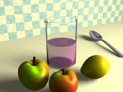
Because the light source in the new test is wholly directional, it cannot spread across the two perpendicular surfaces in a realistic way. Interior lighting, especially from a window light, will not have such rude contrasts. So one possibility might be to bring up the intensity of the ambient light and bring down the intensity of the directional light source.

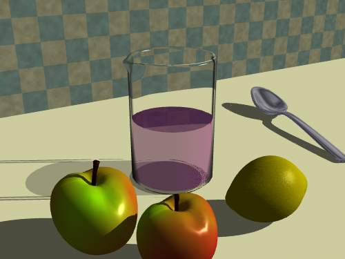
Hmmm. The lighting balance is better as between the wall and the table, and the shadows are now softer due to the ambient lighting. That's a plus we should remember for other projects. But the problem is that the greater reliance on the ambient lighting is stripping out the shading and texture in the fruits, as we saw demonstrated earlier in this lesson. So we've traded one kind of flatness for another.
Let's try another direction.
We'll bring the ambient light way back down, and add a point light in addition to the directional light. The point light, like a true light bulb, sends rays in every direction from the point it is located. Here, consistent with the idea of light entering from above and to the right of the image, the point light is placed accordingly. Here's the result.
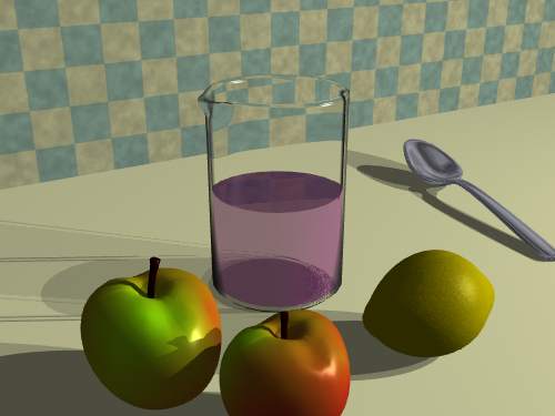
Undoubtedly an improvement. The lighting is spread more generally, and more importantly, a new kind of shadow has been created. With both light types together in the same scene, it's easy to compare. The point light has created both a more diffuse shadow, and one with a less obviously directional shape. The multiplicity of shadows is good for the image. Look back at the final render above to compare these kinds of shadows with the kind ultimately obtained. This gives us, perhaps, an idea.
Let's get rid of the directional light altogether and create a number of bulb lights, all located in the same general area, but with some offset. We'll reduce and balance the intensity of these lights so as not to overpower the scene. Here's a trial with four point lights.
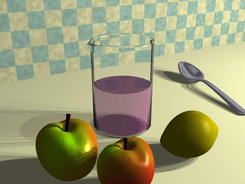
Not bad at all! Even with only four lights, the multiple overlapping shadows begin to establish a strong sense of interior lighting with a flavor not all that different than our final version. Some viewers may actually prefer this last trial from an esthetic viewpoint because it is a bit bolder, without compromising the softness and complexity of the shadows too greatly.
The final render is essentially only an extension of the direction in which we're now headed. Adding more and more point lights, with their conflicting shadow patterns, brings us closer to the gentle smear of shadowing found in the final render. Thus, good interior lighting often require the assemblage of very many light sources to simulate the complex mood of true radiosity rendering. The new 5.5 version of Lightwave 3D, which was used for this project, has introduced an effective shortcut called "area lighting" which creates an array of point light sources as a single object that can be sized, rotated and positioned. This is definitely a useful tool, but not a strictly necessary one. The same effect could have been created by manually creating and positioning a sufficient number of lights.
| To Return to Parts 1 and 2, Use Arrow Buttons |
|
Created: August 26, 1997
Revised: August 26, 1997
URL: https://webreference.com/3d/lesson18/part3.html
 Find a programming school near you