3D Animation Workshop: Lesson 18: Light, Shadows and Feelings
|
|
Lesson 18 - Light, Shadows and Feelings - Part 1
Let's dive back into photorealism and explore the role of lighting and shadow.
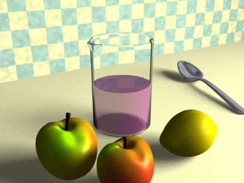
Here's the finished render again from the previous lesson
.
Photorealism can mean a couple of different things. A photorealistic object can simply be very well modeled and surfaced--its geometry and surface characteristics (diffuse color, specular highlights, etc.) can be very convincing.
For example, here is an apple all by itself.
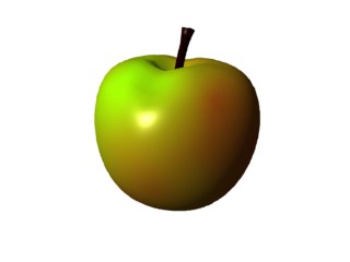
If you compare this object, as convincing as it looks, with the entire still-life scene above, you can readily tell how much more ambitious it is to create a photorealistic scene.
In the scene, light becomes an active element, tying the objects together and creating the sense, not of collected objects, but of a space embodied by the interaction of light and objects. That space has a feeling and a mood. In this case, the mood is sunny, with the freshness of the early morning. But a couple of quick changes in the environment can change the ambiance quite radically.
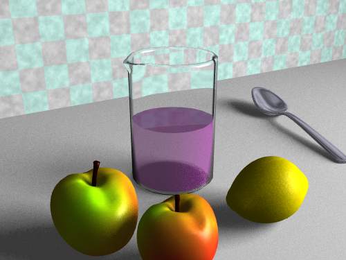
The feeling is now cool, and there is much less sense of the light itself filling the scene. Yet the only changes made were in the DIFFUSE COLOR of the counter and wall surfaces (to gray), and in the color of the light (from slightly yellowish to pure white). These small environmental changes have the most considerable effect on our feelings toward the space embodied by the scene. In short, the 3-D artist must learn to think about the character of the space--the environment--of the scene as whole. The character of the environment sells the scene because it generates a subtle, but convincing, emotional response in the viewer. Spaces, and particularly indoor spaces, evoke feelings. In this sense, the artist is working as much on the viewer's mental environment as on the apparent physical environment of the image.
To beat the point in unmercifully, consider the previous version revised to use a very warm light color, the pale orange of the approaching sunset.
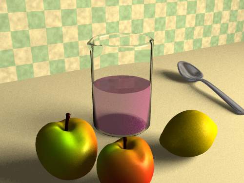
The gray diffuse color in the prior render has been whitened up a bit to better reveal the color of the light. If you compare the two images, you can readily see how the very warm light has moved the blue on the wall toward green. A similar (but necessarily smaller) warming effect has occurred with the purple liquid, and even the lemon is slightly reddened. These details are worth analysis, but to the general viewer, they add up to a feeling, literally an atmosphere. The persuasive effect of photorealistic graphics depends as much, if not more, on this affective sense of environment, as it does on realistic geometry and shading of the individual objects. In this we can learn much from the fine photographers.
| To Continue to Parts 2 and 3, Use Arrow Buttons |
|
Created: August 26, 1997
Revised: August 26, 1997
URL: https://webreference.com/3d/lesson18/
 Find a programming school near you