Graphic Greats: Production Graphics with Wendy Peck at webreference.com | 15
 |
Graphic Greats: Rough It Up |
|
|
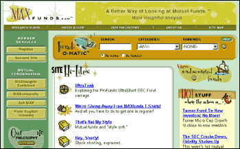
The logo, designed by Nic Sims, was the beginning of
the graphic work on this site. Note how it is integrated into the menu
on every page.
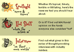
Andy Tanguay's illustrations, with a hand-drawn look, are scattered throughout the site for a fresh and friendly mood. But notice how easy it is to see the information. The art enhances, not detracts from the purpose. Most people would not think that graphics were important to the success of a financial site. We think it is as important as the hard data. We wanted a cool, hip style to put forth an image that we are different ... and it is working. The design is working so well we have discovered an untapped market. People write to tell us that they do not have much experience, but that our site is not intimidating. In this case, the design is driving new opportunities to us. We are very happy! Jonas Ferris, CEO Maxfunds.com
Headings are easily read, yet there is always an element of fun. Repeating elements tie the site together through many color and style changes to present information in the best way.
Call-out quotes throughout the site make information easily available. |
This week I once again follow the Rough It Up tutorial with some great site samples. Graphic Greats has become very popular. You seem to like seeing other designers' work, and discussing why they are successful. Well, this time I've gone one step further for you. I picked one of the sites featured in this issue and interviewed the designer about the site. Maxfunds.com Maxfunds.com entry page Yasmine graduated from the University of Michigan with an Art History major, and taught herself graphic design. She worked in print for 4 years before moving to Web design about 2 years ago. She has been with Enlighten for 14 months. As a testament to the power of a Web presence, it was the quality of the Enlighten Web site that motivated Yasmine to leave the freelance world and pursue employment with this company. Maxfunds.com was released to the public on February 15, 2000. Wendy: What information did you start with on this project? Yasmine: I knew that Maxfunds.com was a company with young management, and that they were presenting a new approach to this industry. They wanted a retro style, but it had to appeal to a wide range of people. Wendy: Did you do all the graphics for the site? Yasmine: I was strictly the designer. Nic Sims designed the logo, and Andy Tanguay did all of the illustrations and 3D work. There were a lot of other people involved as well. Steve Busch deserves a lot of credit as the Art Director for this project. Wendy: Can you share a little about the process of the project? Yasmine: I started with research. I looked at as many financial sites as I could find to see the general format, how the information was placed, where on the site to find things. There were two tracks I had to follow for this project. First, I could never forget that this was a financial site and that it was utilitarian. While the goal was to make it look different, fun, a site people would notice, it also had to serve an audience that was strongly financial, possibly over 60 years old and conservative. Wendy: Did you also research for the design? Yasmine: Some, although I try not to look at too much. I knew that the base was retro, but I wanted a new twist. I did flip through a couple of old books, but, for the most part, it came from somewhere in my head. Wendy: Was this a tough design for you? Yasmine: Surprisingly, this one came together really smoothly. It is not always like that. It was fun to design, but I was constantly trying to check what I did for functionality. It would have been easy to get carried away, but the functionality was the most important aspect. There's a tiny glimpse inside the development of this site, which took between 2-3 months to complete. Make sure you take a trip to Maxfunds.com and a side trip to see Enlighten . The Disney Learning Partnership is another of Yasmine's projects. Carry on to the next page to see more great sites, all featuring something out of the ordinary to Rough It Up and stand out from the crowd.
|
|
 Wendy
Peck is a working Web designer and writer living in NW Ontario, Canada.
https://wpeck.com Wendy
Peck is a working Web designer and writer living in NW Ontario, Canada.
https://wpeck.com |
Graphic Greats IndexMaxfunds.com Profile |
URL: https://www.webreference.com/graphics/
Created: Mar. 8, 2000
Revised: Mar. 8, 2000


 Find a programming school near you